
The Art of Photography
Written by: xerai
The Art of Photography - quite simple in principle, not hard at all, though one of the more less mainstream arts I've noticed. It's even more obscure than writing! Anyway, the art of photography is more or less just made up of guidelines, at least basic photography. It gets wider when you choose your own subjects to photograph. But that's different, up to the artist.
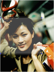
The most important rule and probably the most dominant, as it covers nearly everything, is the rule of thirds. The rule of thirds is easy to grasp. You mentally split your picture into nine squares: three thirds going across, three thirds going down. The center square, the fifth one, is a no go area. Try to avoid any prominant foreground objects ending inside the area. The best squares are the first, third, seventh and ninth. Refer to the images below.
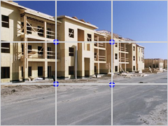
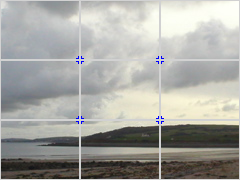
As the pictures show, nothing starts or ends in the middle vertical area, or middle horizantal area. Centering objects in landscape format is horrible and leaves large gaps of half-shown background, which ruins it. This rule generally works for landscape photographs. In close up photographs of a specific object, the guideline can be relaxed.
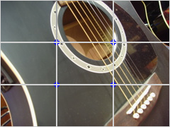
As shown here, the rule of thirds is generally demolished as the object fills the whole picture frame. But there are still lines that will give the photograph composition. The strings of the guitar and the bridge travel in opposite directions and aren't parallel with the edge of the picture.


The composition lines are lines that the viewers' eyes will naturally follow. These are important. If you have composition lines that are parallel with the edges of the picture, your photography will look flat and boring. Composition lines will give depth to your picture, which is what you're trying to achieve.
As you see on the road, the composition lines point inwards and go further away, getting smaller. This leads the eye easily. It'll stop the viewer from staring at your picture and they'll actually look at it. The guitar is harder and not as significant, but they are still there. They only give small depth, which is all that is needed for a close up picture.
The picture below is a scrap picture, a picture I'm using for the sole purpose of drawing a complete guitar; I couldn't have do special angles or good composition. I needed a boring shot of a guitar. So here it is.
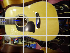
You can see the bad positioning, the almost-parallel lines and lack of interest generally. Compare the black guitar to the one above. Notice the difference. The black one is far better.
Pre-focusing the camera and then moving it to re-compose the image before capturing it. Accomplished by half-pressing the shutter button and keeping it held at that position while moving the camera to another point before pressing it all the way to capture the image.