
I'm going to accept all the entries for this round, because while some are a little borderline as to whether they follow the rules, I was quite vague when actually making them
Judges: All the entries can be found on the previous page, so please use it a a resource when submitting your grades.
The PPT Graphics Academy III - Round Four
Moderator: Moderators
Re: The PPT Graphics Academy III - Round Four
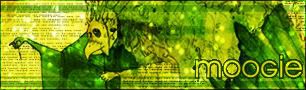
v: Lifebreather ----- c: Neko
-
Kitten Medli

- Way Beyond Godly

- Posts: 6691
- Joined: Tue Jun 01, 2004 5:55 am
Re: The PPT Graphics Academy III - Round Four
So uh.. whats up? I'm not exactly excited for ratings for my shoddy wallpaper but I was wondering whats going on hur.

Re: The PPT Graphics Academy III - Round Four
im sorry for the delay, I was looking for a replacement judge for bangel (who regrettably had to stop judging), and doing other things for school. I don't know what rage is doing though. I'll get my jdgings done tonight or tomorrow morning.
v: Lifebreather ----- c: Neko
Re: The PPT Graphics Academy III - Round Four
hi, my computer is busted.... so i cant really make new graphics.
which means for future rounds, i can only submit the ones i've done from the past....
in another words...if the graphics i've made from the past doesnt qualify, i'd have to give up the competition.
>___<
which means for future rounds, i can only submit the ones i've done from the past....
in another words...if the graphics i've made from the past doesnt qualify, i'd have to give up the competition.
>___<
- w i s
Re: The PPT Graphics Academy III - Round Four
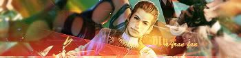
blueZ: Interesting. You blended the multiple images very well. My main issue with this wallpaper is the main image, though. I think you did too much to it. the borders start looking strange after the second or third one, and I especially don't like the most inner border, as it makes the secord border looks pixely. The concept is nice, but the aesthetics are hust by the problems i mentioned. 6.5/10
Laryxle: Hmm, there's some good and mad to this wallpaper. The blending you did is nice, though not perfect. Two of the pictures are of nice quality, whereas the other two are not so nice. And while the text is nice, I'm pretty sure there's a more fitting font for this wallpaper. A nice job, with some room for improvement. 6.5/10
Kitten Medli: I can definitely see improvement in your graphic skills from this competition compared to others. And while this wallpaper is the best I've seen, it quite nice. The colors work well, even the upper and lower bars, which took me a while to warm up to. The brushes you chose are of good quality, and give the background an interesting grunge feeling. My one major problem with this one is the text. Its incredibly hard for me to read, and I don't the the introduction of dark reddish hue for its border is helpful to the graphic. Overall, a good intry though. 7.5/10
WIS: Simple, but simple is perfect for wallpapers. The different angles really help to add depth to the piece, and the recurring text really works here. There's not much I can say about this piece due to its simplicity, aside from the fact that it really, really, works for me. 10/10
---
sorry for the huge delay this round. I'm contacting the other judges to see if they can get some ratings in or not. If not, I'll have to see if I can get them from somewhere else.
Laryxle: Hmm, there's some good and mad to this wallpaper. The blending you did is nice, though not perfect. Two of the pictures are of nice quality, whereas the other two are not so nice. And while the text is nice, I'm pretty sure there's a more fitting font for this wallpaper. A nice job, with some room for improvement. 6.5/10
Kitten Medli: I can definitely see improvement in your graphic skills from this competition compared to others. And while this wallpaper is the best I've seen, it quite nice. The colors work well, even the upper and lower bars, which took me a while to warm up to. The brushes you chose are of good quality, and give the background an interesting grunge feeling. My one major problem with this one is the text. Its incredibly hard for me to read, and I don't the the introduction of dark reddish hue for its border is helpful to the graphic. Overall, a good intry though. 7.5/10
WIS: Simple, but simple is perfect for wallpapers. The different angles really help to add depth to the piece, and the recurring text really works here. There's not much I can say about this piece due to its simplicity, aside from the fact that it really, really, works for me. 10/10
---
sorry for the huge delay this round. I'm contacting the other judges to see if they can get some ratings in or not. If not, I'll have to see if I can get them from somewhere else.
v: Lifebreather ----- c: Neko
Re: The PPT Graphics Academy III - Round Four
Ok, so it looks like none of the other judges are judging (from the looks of the activity, anyway). So I'm polling you guys. Do you want to continue to the finals as the four of you? I will find at least one other judge to judge the graphics.
v: Lifebreather ----- c: Neko

-
Kitten Medli
- Way Beyond Godly
- Posts: 6691
- Joined: Tue Jun 01, 2004 5:55 am
Re: The PPT Graphics Academy III - Round Four
Sure, fine by me.
Re: The PPT Graphics Academy III - Round Four
Sorry for the delay getting this round started. but its here now! Expect as much time as the four of you need to finish the round, as there will be TWO assignments.
Good luck, and finish when you can. Please do it in a timely manner, but I will wait for you all to finish.
Final Round Assignment 1:
Set:
- Create a Set
- The dimensions has to be within PPT Limits (The Dimensions are specified in this thread)
- The image size does not have to be within PPT Limits (KB wise)
Final Round Assignment 2:
Anything:
- Create Any graphic from any of the previous rounds
- All requirements and limits from those rounds do not apply to this one. You can do anything you want.
Good luck, and finish when you can. Please do it in a timely manner, but I will wait for you all to finish.
v: Lifebreather ----- c: Neko
Re: The PPT Graphics Academy III - Round Four
It looks that way, so yes, if you want, make two sets.
v: Lifebreather ----- c: Neko
Re: The PPT Graphics Academy III - Round Four
ok im gonna submit something by this weekend.
im just writing this so i can force myself to do it in time
im just writing this so i can force myself to do it in time
- w i s
Re: The PPT Graphics Academy III - Round Four
Ok here are mine  Good luck everyone
Graphic 1 - Set
Avatar -

Image - Here
Program used - Gimp 2.2
Signature -
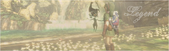
Image - Here
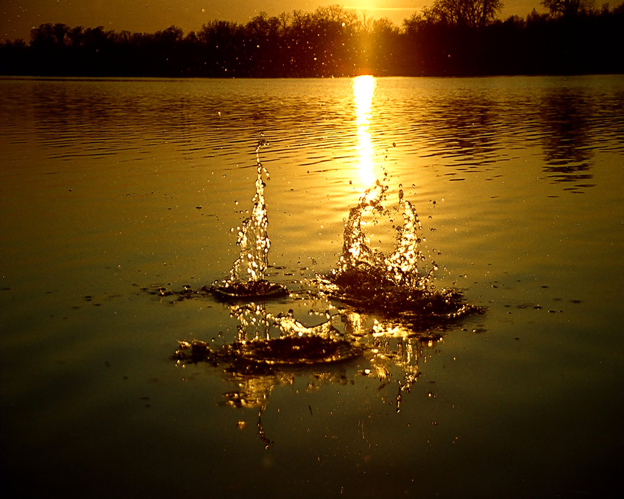
Graphic 2 - lj icon

Image - here
Program used - Gimp 2.2
Hope I did it right ;o
Good luck everyone Graphic 1 - Set
Avatar -
Image - Here

Program used - Gimp 2.2
Signature -
Image - Here
Graphic 2 - lj icon
Image - here
Program used - Gimp 2.2
Hope I did it right ;o
set by me
Re: The PPT Graphics Academy III - Round Four
just sending a post out to see if there's still interest from the rest of you to finish. Please let me know.
v: Lifebreather ----- c: Neko