Tue Aug 10, 2004 11:42 pm
Dawn2 wrote:Dobbitron wrote:Someone should remind them >_>.
Twiz is cool... tis a dare, I tell you! A dare!
Nope, I don't think they should. If people are disqualified for not following up with what they started, I think they should be taught a lesson by being disqualified.
You don't submit your entry, you don't get to participate. Simple as that. No reminders are given.
I have counted 21 entries. Crystal Cloud's is not neccessarily an entry. I found no post in the previous thread saying they wanted to join. (Someone please correct me if I'm wrong)
I am missing entries from the following people:
Morianna
Cheese
Adam
Link
Again, someone please correct me if I'm wrong.
(The above 4 also have time to complete their entries still)
Wed Aug 11, 2004 6:18 pm
Question: Since there are more people in this contest than the last two do we have more time to finish these rounds?
(Also a bump =D)
(Also a bump =D)
Wed Aug 11, 2004 6:20 pm
Kristina wrote:Question: Since there are more people in this contest than the last two do we have more time to finish these rounds?
(Also a bump =D)
Yup. Last time, people got 3-4 days to finish. This time, it's 4-5 days. Not a big difference, but you be surprised in what a day can do.
Wed Aug 11, 2004 11:26 pm
Dawn2 wrote:Kristina wrote:Question: Since there are more people in this contest than the last two do we have more time to finish these rounds?
(Also a bump =D)
Yup. Last time, people got 3-4 days to finish. This time, it's 4-5 days. Not a big difference, but you be surprised in what a day can do.
Huh. You know, I never actually realized I'd done that until you pointed it out.
Still waiting on the same four people, I believe.
Link, I'm going to smack you if you don't submit anything!
Thu Aug 12, 2004 7:56 am
Ugh, I wanna know if I got through  Please hurry up you four!
Thu Aug 12, 2004 1:58 pm
Here's my set:


Thu Aug 12, 2004 2:04 pm
I changed my entry, I hope it's not too late. I figured the original one was crummy, just telling you. Its on my original post, incase you had saved them or somthing the like.
Thu Aug 12, 2004 3:33 pm
I'm with tomatie. There has been plenty of time.
Thu Aug 12, 2004 6:37 pm
polarbearpop wrote:I'm with tomatie. There has been plenty of time.
Whether there has been plenty of time or not is for me to decide, not you. And as you can see, I have received one of the missing entries, and people have also edited their entries.
Once the time limit is up, I will post everything into the one post for ratings. Then, and only then.
Thu Aug 12, 2004 10:09 pm
Judges, rate them all (which could take a while....) and then choose two which you think do not qualify for round 2.
If I forgot your entry, please tell me. There were a lot, and there's a good chance I might've missed one somewhere.
polarbearpop


Images: http://gcgcsa.com/kk/sigs/sandy.jpg
http://cube.oit.duke.edu/~dds/roses/america2.jpg
http://i.walmart.com/i/p/00/73/91/36/40 ... 15X215.jpg
Program Used: Adobe Photoshop 6.0
bluehawaii19


Program Used: Adobe Photoshop CS
Dobbitron

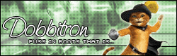
Image: http://img.photobucket.com/albums/v292/ ... guard2.jpg
Program Used: Adobe Photoshop 6.0
Shifty

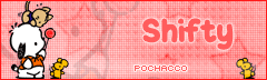
Image: http://www.sanrio.com/main/charactersec ... n2full.gif
Program Used: Adobe Photoshop
Neopets Addict


Image: http://img.photobucket.com/albums/v36/T ... /Viera.bmp
Program Used: Photoshop CS and Paint Shop Pro 7
Koku


Image: http://img.photobucket.com/albums/v35/e ... ckbird.gif
Prgram Used: Adobe Photoshop 7
Shadowfare

Image: http://akemishi.free.fr/furuba-shigure-wp.jpg
Program used: Photoshop Elements
Apricus


Image: http://img.photobucket.com/albums/v385/ ... llapic.jpg
Program Used: Paint Shop Pro 8
Amethyst


Program Used: Photoshop Elements
DM was on fire!


Images: http://thoiathoing.250free.com/dmgppttgc.gif
http://thoiathoing.250free.com/dmgppttgmp.jpg
Program Used: Paint Shop Pro 8
Kristina

Image: http://bestanime.co.kr/BAPDSFEB1001/ima ... img050.jpg
Program Used: Photoshop CS
Neko

Image: http://img.photobucket.com/albums/v199/Fukumi/jan72.jpg
Program Used: Adobe Photoshop CS
paola

Image: http://www.animewallpapers.com/wallpape ... 7_1024.asp
Program Used: Adobe Photoshop 7.0
Kyra

Image: http://img.photobucket.com/albums/v31/k ... ane/35.jpg
Program Used: Adobe Photoshop 7
Feather


Image: http://img35.exs.cx/img35/4305/contest_pic.gif
Program Used: Adobe Photoshop 7
quicksilvery1pore


Image: http://img.photobucket.com/albums/v50/m ... G_6945.jpg
Program Used: Adobe Photoshop 7
Optimus


Image: http://img.photobucket.com/albums/v55/B ... tamama.jpg
Program Used: Paint Shop Pro
tomatie

Image: http://img.photobucket.com/albums/v47/t ... clancy.jpg
Program Used: The Gimp
Rikio


Images: http://img.photobucket.com/albums/v37/M ... lyZero.gif
http://img.photobucket.com/albums/v37/M ... thWhip.jpg (faded in background)
Destiny


Image: http://www.frog.co.nz/images2/sunflower.jpg
Programs Used: Paint Shop Pro 7, Animation Shop 3, MS Paint
Hellyer


Image: http://img.photobucket.com/albums/v147/ ... /alone.jpg
Program Used: Adobe Photoshop 7
Cheese
If I forgot your entry, please tell me. There were a lot, and there's a good chance I might've missed one somewhere.
polarbearpop
Images: http://gcgcsa.com/kk/sigs/sandy.jpg
http://cube.oit.duke.edu/~dds/roses/america2.jpg
http://i.walmart.com/i/p/00/73/91/36/40 ... 15X215.jpg
Program Used: Adobe Photoshop 6.0
bluehawaii19
Program Used: Adobe Photoshop CS
Dobbitron
Image: http://img.photobucket.com/albums/v292/ ... guard2.jpg
Program Used: Adobe Photoshop 6.0
Shifty
Image: http://www.sanrio.com/main/charactersec ... n2full.gif
Program Used: Adobe Photoshop
Neopets Addict
Image: http://img.photobucket.com/albums/v36/T ... /Viera.bmp
Program Used: Photoshop CS and Paint Shop Pro 7
Koku
Image: http://img.photobucket.com/albums/v35/e ... ckbird.gif
Prgram Used: Adobe Photoshop 7
Shadowfare
Image: http://akemishi.free.fr/furuba-shigure-wp.jpg
Program used: Photoshop Elements
Apricus
Image: http://img.photobucket.com/albums/v385/ ... llapic.jpg
Program Used: Paint Shop Pro 8
Amethyst
Program Used: Photoshop Elements
DM was on fire!
Images: http://thoiathoing.250free.com/dmgppttgc.gif
http://thoiathoing.250free.com/dmgppttgmp.jpg
Program Used: Paint Shop Pro 8
Kristina
Image: http://bestanime.co.kr/BAPDSFEB1001/ima ... img050.jpg
Program Used: Photoshop CS
Neko
Image: http://img.photobucket.com/albums/v199/Fukumi/jan72.jpg
Program Used: Adobe Photoshop CS
paola
Image: http://www.animewallpapers.com/wallpape ... 7_1024.asp
Program Used: Adobe Photoshop 7.0
Kyra
Image: http://img.photobucket.com/albums/v31/k ... ane/35.jpg
Program Used: Adobe Photoshop 7
Feather
Image: http://img35.exs.cx/img35/4305/contest_pic.gif
Program Used: Adobe Photoshop 7
quicksilvery1pore
Image: http://img.photobucket.com/albums/v50/m ... G_6945.jpg
Program Used: Adobe Photoshop 7
Optimus
Image: http://img.photobucket.com/albums/v55/B ... tamama.jpg
Program Used: Paint Shop Pro
tomatie
Image: http://img.photobucket.com/albums/v47/t ... clancy.jpg
Program Used: The Gimp
Rikio
Images: http://img.photobucket.com/albums/v37/M ... lyZero.gif
http://img.photobucket.com/albums/v37/M ... thWhip.jpg (faded in background)
Destiny
Image: http://www.frog.co.nz/images2/sunflower.jpg
Programs Used: Paint Shop Pro 7, Animation Shop 3, MS Paint
Hellyer
Image: http://img.photobucket.com/albums/v147/ ... /alone.jpg
Program Used: Adobe Photoshop 7
Cheese
Last edited by Flame on Sat Aug 14, 2004 1:54 am, edited 1 time in total.
Thu Aug 12, 2004 10:20 pm
i know i'm not part of this, but i've been watching, and WOW, the judges have got some really hard decisions to make, as they're all FANTASTIC!
Fri Aug 13, 2004 2:16 am
This will be the First Round I have ever rated. Please bare with me.
polarbearpop
Avatar: The Avatar is nicely done. The text 'Lady' corresponds well with the text 'Ladycollector' on the Signature which compliments both images. The rose image used in the Avatar is wonderful. The red rose petals which are now a delicate pink gives a soothing feeling. It looks slightly faded which is a nice effect to use. The sparkle effect looks too crowded on the Avatar, making it look busy.
Signature: First of all, the blending techinique used to blend all the images together is nicely done. The roses and dog blend in together and the brightness on the dogs head helps it blend in with the pink roses. The Sub-Text is right in your face which is very good if that's where you want all the attention. If not, I would suggest using a lighter font colour, a lighter green and maybe a thiner border but not too thin. The text 'Ladycollecter' corresponds well with the Avatar as mentioned earlier. The sparkle effect, I believe, is overly used. It's a nice touch but it looks a little crowded on the left side of the signature. You could've spread them out more, but instead there seems to be more sparkles in one place than another. The thin border gives the whole set a calm feeling which I believe you were going for.
Overall: 9/10
bluehawaii19
Avatar: The background is beautifully done, it shows you were going towards a green/yellow which you accomplished. However making the text transparent or blending it in the background causes a little confusion. A text on an avatar should not be difficult to see or read. But when I first look at this avatar I have to scrunch my eyes and move towards the monitor to read what it says. This shouldn't be the problem. You should've choose a more visible/original font and outlined it with a thick black layer surrounding each letter. If you wanted to keep the green/yellow effect, than use a darker green/yellow and fill in the letters making it stand out with the black already outlining it. The border is nicely done, although it could've been darker.
Signature: The background here is nicely done as the avatar is but the Sub-Text is barely readable like the text on the avatar. A non-transparent font, a thick dark outline and darker greens/yellows should've been used. The font choice for 'Shoelace' is very elegant. However the outlining could've been darker, as the end of the 'S' is dissapearing within the yellow. Again the border is nice, however it could've been darker.
Overall: 7/10
Dobbitron
Avatar: First of all, this set is what I like to call a "Safe Set". It's not horrible and it's not wonderful. It's in between. The Avatar background makes the image (Puss 'N Boots) stand out. I believe that is what you were aiming for. The green makes the orange stand out immensely. However the main text should not have been vertical. The image could've been moved to the bottom right, cutting it off a little but making the text horizontal. The font could've been changed to something more cutesy to match the cat itself. But this font looks nice as well. The thin, black border shows the simplicity of the set.
Signature: The main image on this set (Puss 'N Boots) stand outs very well in the sea of greens you have chosen. However, I believe this background should not have been chosen. On the Avatar it looks nice for the cats hand is cut off, hiding the sword. But on the Signature the hand it clearly there and the cat is holding the sword. But you cannot see the blade of the sword as it's too thin. It looks like the cat is holding a metal shield. The blade itself is gray therefore making the background a light or dark yellow would help the blade stand out more. It looks like the blade is completly erase from the handle. The main font choice is great, it's cute and somewhat elegant in a way. This compliments the image of the cut cat wonderfully. However the Sub-Text font would look much nicer and make it stand out more if it was a different font. The border matches well with the border around the Sub-Text, making them correspond.
Overall: 8/10
Shifty
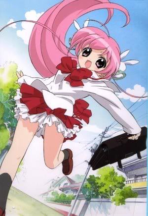
Avatar: The border around the Avatar is nicely done, the not too dark red compliments the pinkish-red wonderfully. The image itself is cropped wonderfully and shrunk well making it fit in the Avatar. The pink hearted background is a nice choice, for this sets main objective is to be cute and the background shows just that. However the text displaying vertically doesn't go well with the set. The image could've shifted down a little, cutting it slightly but at the same time making the text horizontal. A little cutting won't harm the set.
Signature: The border once again is nicely done, good choice of the red colour. The background is nicely done, the small faded images of stars and the large close up faded imaged of the main image goes well with the theme of 'cuteness' with the set. The main font choice, is very cute. It's bubbly, it's pink and has a faded white border around it. Although the white border could've been slightly brighter. The main text could've been centered or at least aligned with the Sub-Text. Making it look even. The sub text font colour could've been a darker red, I believe it's ligther than the font colour on the avatar. The small mouse in the corner gives the set a balance feeling and adds more 'cuteness'.
Overall: 9/10
Neopets Addict
Avatar: First off, the border looks a little to thick, it should've been slightly thinner. The text 'Viera' is nicely done, making it black stands it out on the beige like background. The background is beautifully done, clearly corresponding to the colour of the characters clothes. The white lines around the Avatar gives it an elegant feeling and appearance.
Signature: The border, again is a little to thick but it doesn't harm the set in anyway. The main font choice is wonderfully chosen; it stands out on the background and makes the set look nice. The sub text has a slight peach border around it making it stand out above the background. The image and background compliment each other and are wonderfully chosen.
Overall: 10/10
Koku
Avatar: The thin, black border should've been slightly thicker. The black and white colouring which is used on the bird and the moon is wonderfully done. It proves that the bird is infact a black bird, as writtin in the Avatar and Signature. Howebver, I did not even see the text 'Blackbird' until I leaned in closer. It should not have been placed in the center of the bird but more to the top left. Once the shading near the top left is slightly gone than the text would look wonderful there. The background obviously is white with the shading coming from the bird itself. This helps fill the background and gives it a dark, misty feeling.
Signature: The Signature is done in the same way as the Avatar which is good. Part of the moon is now visible which helps fill the background. The main font choice goes wonderfully with the entire set. It's nice and dark just like the set itself. The handwritten text brings a sense of originality.
Overall: 9/10
Shadowfare
Avatar: The thin purple border goes will with the thin outline of the characters face. The purple background is corresponding with the original purple background in the image. It's nicely done and the purplish colouring of the characters goes well with it. The main text is wonderfully done beacuse of the white font and the dark purple outline. And the small white dots around the text stand it out even more.
Signature: The signature to me is the avatar stretched out. With the exception of the main and sub text. The main text is barely visible, shouldn't of been added in the first place. Either choose the mini font or the equisite font for the main text. Not both. The sub text is way too dark, the dark purple does not go well with the set. The black outline should stay whereas the dark purple colour should be replaced with a lighter purple colour.
Overall: 7/10
Apricus
Avatar: To start off, the Avatar itself has a yellow border which should've been either black or another darker colour. You overused yellow alot in the Avatar and Signature. The main font is readable while it's a different shade of yellow, you outlined it with a darker colour which makes it readable. As for the image, you darkened the colour of the sticks/twigs and you drenched the flower in a coat of yellow. That was your mistake. It does not make the flower stand out as much as I think you'd like it to. The overdose of yellow gives the set a narrow feeling, a close minded feeling. You didn't experiment with any other colour except yellow and a little black.
Signature: The signature has the same problem as the Avatar. The yellow border and the overdose of yellow. The main font choice is selected well. It stands out, and is readable. However I think you should've stirred away from the yellow colour fill. The sub-text is readable and again the outline is used. However, what really bothers me is the grid. The grid should've not of been there as it steals the attention away from the main image. Even though you used a fading effect on the grid making it fade from the left side and reappear on the right, it still steals the attention. For some reason, it makes the sub-text a little less readable, making viewers go a little closer to the screen to read it.
Overall: 7/10
Amethyst
Avatar: The Avatar is very plain but elegant. It does not need to be filled with an image of some sort as the background does the job nicely. However, the font is readable but the colour of the font should've been a lighter colour, like white. The thin lines you added is a nice touch, giving the set an elegant feel. However maybe a few extra lines should've been added to correspond with the signature. The main texts would match and therefore correspond.
Signature: The Signature again like the Avatar does not beg for an image. It's filled. The sub-text however is too slow. It should be a little more faster, not too fast, but faster than the speed you have right now. The main font choice is very nice and elegant but the 'Y' is slightly cut off at the bottom which you should've watched out for. The horizontal lines again, correspond with the Avatar but not as much for the Avatar should've had more thin lines. The border is nicely done, thin and black which compliments the whole set.
Overall: 8/10
DM was on fire!
Avatar: Purple, I see is your main theme in this set. The border which has a white colour fill drags away from the purple feeling demonstrated by the set. The image is very goofy like which adds to the 'cuteness' of the Avatar. The main font colour which is white is a good choice as it stands out on the shade of purple you used. The faded white words across the Avatar is a nice touch, however I can barely see them unless they are on the dark part of the character's hair. Otherwise nice feature.
Signature: I like the main font choice used on the Signature. It's goofy and cute just like the image. Good correspondence. The sub-text is clearly visible on the shade of purple. However, the white faded text, again is visible on the darker parts of the character. It's a nice touch and it isn't a distraction from the sub text, main text and the character. The flipped closed up faded character creates a balance with the character on the right side. Nice effect.
Overall: 10/10
Kristina
Avatar: I love the border, it's original and nicely done. The image has been cropped wonderfully, judging by the picture it looks like it was a tough job. However I believe the font, background and border color should not have been the same color. It ruins the originality of the whole set. You can barely read the main text, a dark outline (black or any other darker colour) should've been used to outline the text. Making it stand out more.
Signature: The border again, original but it blends in too much with the whole set. It should've stood out a little, make it a tad darker. The main font choice colour was poorly chosen on the fact that it blends in too much with the background. It's a nice font but there is no point of having it if it's barely readable amongst the background. This is the same problem with the sub-text, it blends in way too much and it's barely readable. A darker outline around the sub-text and a darker colour fill for the main font would've been much nicer and more presentable.
Overall: 6/10
Neko
Avatar: The cutout is absolutely wonderful. It's original and makes the Avatar unique. The font, is readable because of the light border around the red text. The Avatar is wonderfully made.
Signature: I unique border once more is used, with a few thick lines heading inward making the Signature unique. The three white small squares at the bottom left and top right balances the Signature. The background corresponds with the character, in the colour sense. However, the blending can be slightly better but it's not a distraction. The main font choice and colours are wonderful. You chose an elegant font with a clear dark-like outline and dark text. This makes it stand out. The sub-text has a the same colour border as the main text does, corresponding them both. The sub-text font although thin, is readable and stands out wonderfully.
Overall 9/10
paola
Avatar: The dark, thick black border works well the image and the secondary border created by the image itself compliments it. The background is the original background in the link you gave Flame. It's original in the sense of the idea; you faded it, you added a grid pattern and gave it a charcoal effect. The thin lines across the Avatar gives matches well because this whole set is very tense, as the character is portraying. The main text is readable although the outline could've been slightly darker.
Signature: The Signature has the two borders just like the Avatar which looks very nice. The background is a bid more shaded which adds a nice effect. The main text matches with the whole image perfectly, and the smudged look across the text makes it that much more original. The sub-text is readable but a darker outline would be nicer and make it even more readable.
Overall: 9/10
Kyra
Avatar: This set is another "Safe Set". It's not horrible yet it's not fantastic. The background chosen suits this set because of the characters pink hair. It matches perfectly. The main text should've had a darker outline, making it more readable. The font should've been changed as the 'M' looks like an 'N' on first sight. Which shouldn't happen. The border is thin and black which is nice.
Signature: The Signature has the same problem with the sub-text. It's not that readable and the font should be changed. Add a darker outline to it. The main font choice is cute, bubbly and girly just like the set. It matches well and it stands out immensely. The image has a blurred effect which looks better than if it was simply cropped and nothing was added to it. The border is exactly like the Avatar, thin and nice.
Overall: 8/10
Feather
Avatar: First of all, I loved the thick black border. It corresponds nicely with the white/gray background. The main text is readable with the white border around the thin gray letters on the flower's petal. This colour management stands it out.
Signature: The border again, is thick and black matching the Avatars. The gridded, gray background fits in well with the grayish theme of the set. The main font is nicely selected, your using the same white border and grey font colour are the sub-text and main text on the Avatar. The dark, bold outline around the flower helps it better stand out and matches well with the border.
Overall: 9/10
quicksilvery1pore
Avatar: Love the border, stands out well. I love how you made the blood or red paint darker and fuller. It looks very cool. The background, fits in well with the whole scientific feeling. The main text stands out, which is probably your intent.
Signature: Everything is demostrated well here. A little to much empty space but other than that, it's well done.
Overall: 8/10
Optimus
Avatar: Like the Avatar, small but full. Nice fading job, filling the entire space. The animation is done well, attracts attention to it.
Signature: I have no problem with anything except for the text. It blends in a little too much, a darker outline would've been best around the text and sub-text. A little lighter colours too, to stand them out.
Overall: 7/10
Tomatie
Avatar: Cute, however the Avatar could use more "life". It looks too plain for my taste. The text could've had a darker outline, making it more readable.
Signature: I like the touch of the hearts and arrow heads, fills the Signature more. However the sub-text could've had a dark outline making it more readable.
Overall: 7/10
Rikio
Avatar: Love the cutout, very original. The background fits in well and even though I dislike vertical text, I like this one. It stands out and catches your attention.
Signature: Is basically a stretched out version of the Avatar. The rainbowish font matches the background. Good call.
Overall: 9/10
Destiny
Avatar: It's plain yet elegant. The colours are wonderful but the main text could be a little more darker.
Signature: The animation is way too fast. Slow it down making it readable without having to stare at it to figure out what it's saying.
Overall 9/10
Hellyer
Avatar: Love the alien theme, if that's what you're going for. The main text could be a little more lighter (the colour white that is) and have a darker outline.
Signature: The sub-text needs to have a lighter colourfill and darker outline. Too much empty space though.
Overall: 7/10
Cheese
Avatar: I wish I had the original image or known that this was created on Photoshop or PSP or something. It's a little to plain and the font is barely readable. You have so much room. Use it. Make the font larger or at least change the style.
Signature: Only having an issue with the font here. The empty space could have a design of some sort to fill it up.
Overall: 7/10
Sorry to say but I think bluehawaii19 and Cheese should go.
polarbearpop
Avatar: The Avatar is nicely done. The text 'Lady' corresponds well with the text 'Ladycollector' on the Signature which compliments both images. The rose image used in the Avatar is wonderful. The red rose petals which are now a delicate pink gives a soothing feeling. It looks slightly faded which is a nice effect to use. The sparkle effect looks too crowded on the Avatar, making it look busy.
Signature: First of all, the blending techinique used to blend all the images together is nicely done. The roses and dog blend in together and the brightness on the dogs head helps it blend in with the pink roses. The Sub-Text is right in your face which is very good if that's where you want all the attention. If not, I would suggest using a lighter font colour, a lighter green and maybe a thiner border but not too thin. The text 'Ladycollecter' corresponds well with the Avatar as mentioned earlier. The sparkle effect, I believe, is overly used. It's a nice touch but it looks a little crowded on the left side of the signature. You could've spread them out more, but instead there seems to be more sparkles in one place than another. The thin border gives the whole set a calm feeling which I believe you were going for.
Overall: 9/10
bluehawaii19
Avatar: The background is beautifully done, it shows you were going towards a green/yellow which you accomplished. However making the text transparent or blending it in the background causes a little confusion. A text on an avatar should not be difficult to see or read. But when I first look at this avatar I have to scrunch my eyes and move towards the monitor to read what it says. This shouldn't be the problem. You should've choose a more visible/original font and outlined it with a thick black layer surrounding each letter. If you wanted to keep the green/yellow effect, than use a darker green/yellow and fill in the letters making it stand out with the black already outlining it. The border is nicely done, although it could've been darker.
Signature: The background here is nicely done as the avatar is but the Sub-Text is barely readable like the text on the avatar. A non-transparent font, a thick dark outline and darker greens/yellows should've been used. The font choice for 'Shoelace' is very elegant. However the outlining could've been darker, as the end of the 'S' is dissapearing within the yellow. Again the border is nice, however it could've been darker.
Overall: 7/10
Dobbitron
Avatar: First of all, this set is what I like to call a "Safe Set". It's not horrible and it's not wonderful. It's in between. The Avatar background makes the image (Puss 'N Boots) stand out. I believe that is what you were aiming for. The green makes the orange stand out immensely. However the main text should not have been vertical. The image could've been moved to the bottom right, cutting it off a little but making the text horizontal. The font could've been changed to something more cutesy to match the cat itself. But this font looks nice as well. The thin, black border shows the simplicity of the set.
Signature: The main image on this set (Puss 'N Boots) stand outs very well in the sea of greens you have chosen. However, I believe this background should not have been chosen. On the Avatar it looks nice for the cats hand is cut off, hiding the sword. But on the Signature the hand it clearly there and the cat is holding the sword. But you cannot see the blade of the sword as it's too thin. It looks like the cat is holding a metal shield. The blade itself is gray therefore making the background a light or dark yellow would help the blade stand out more. It looks like the blade is completly erase from the handle. The main font choice is great, it's cute and somewhat elegant in a way. This compliments the image of the cut cat wonderfully. However the Sub-Text font would look much nicer and make it stand out more if it was a different font. The border matches well with the border around the Sub-Text, making them correspond.
Overall: 8/10
Shifty
Avatar: The border around the Avatar is nicely done, the not too dark red compliments the pinkish-red wonderfully. The image itself is cropped wonderfully and shrunk well making it fit in the Avatar. The pink hearted background is a nice choice, for this sets main objective is to be cute and the background shows just that. However the text displaying vertically doesn't go well with the set. The image could've shifted down a little, cutting it slightly but at the same time making the text horizontal. A little cutting won't harm the set.
Signature: The border once again is nicely done, good choice of the red colour. The background is nicely done, the small faded images of stars and the large close up faded imaged of the main image goes well with the theme of 'cuteness' with the set. The main font choice, is very cute. It's bubbly, it's pink and has a faded white border around it. Although the white border could've been slightly brighter. The main text could've been centered or at least aligned with the Sub-Text. Making it look even. The sub text font colour could've been a darker red, I believe it's ligther than the font colour on the avatar. The small mouse in the corner gives the set a balance feeling and adds more 'cuteness'.
Overall: 9/10
Neopets Addict
Avatar: First off, the border looks a little to thick, it should've been slightly thinner. The text 'Viera' is nicely done, making it black stands it out on the beige like background. The background is beautifully done, clearly corresponding to the colour of the characters clothes. The white lines around the Avatar gives it an elegant feeling and appearance.
Signature: The border, again is a little to thick but it doesn't harm the set in anyway. The main font choice is wonderfully chosen; it stands out on the background and makes the set look nice. The sub text has a slight peach border around it making it stand out above the background. The image and background compliment each other and are wonderfully chosen.
Overall: 10/10
Koku
Avatar: The thin, black border should've been slightly thicker. The black and white colouring which is used on the bird and the moon is wonderfully done. It proves that the bird is infact a black bird, as writtin in the Avatar and Signature. Howebver, I did not even see the text 'Blackbird' until I leaned in closer. It should not have been placed in the center of the bird but more to the top left. Once the shading near the top left is slightly gone than the text would look wonderful there. The background obviously is white with the shading coming from the bird itself. This helps fill the background and gives it a dark, misty feeling.
Signature: The Signature is done in the same way as the Avatar which is good. Part of the moon is now visible which helps fill the background. The main font choice goes wonderfully with the entire set. It's nice and dark just like the set itself. The handwritten text brings a sense of originality.
Overall: 9/10
Shadowfare
Avatar: The thin purple border goes will with the thin outline of the characters face. The purple background is corresponding with the original purple background in the image. It's nicely done and the purplish colouring of the characters goes well with it. The main text is wonderfully done beacuse of the white font and the dark purple outline. And the small white dots around the text stand it out even more.
Signature: The signature to me is the avatar stretched out. With the exception of the main and sub text. The main text is barely visible, shouldn't of been added in the first place. Either choose the mini font or the equisite font for the main text. Not both. The sub text is way too dark, the dark purple does not go well with the set. The black outline should stay whereas the dark purple colour should be replaced with a lighter purple colour.
Overall: 7/10
Apricus
Avatar: To start off, the Avatar itself has a yellow border which should've been either black or another darker colour. You overused yellow alot in the Avatar and Signature. The main font is readable while it's a different shade of yellow, you outlined it with a darker colour which makes it readable. As for the image, you darkened the colour of the sticks/twigs and you drenched the flower in a coat of yellow. That was your mistake. It does not make the flower stand out as much as I think you'd like it to. The overdose of yellow gives the set a narrow feeling, a close minded feeling. You didn't experiment with any other colour except yellow and a little black.
Signature: The signature has the same problem as the Avatar. The yellow border and the overdose of yellow. The main font choice is selected well. It stands out, and is readable. However I think you should've stirred away from the yellow colour fill. The sub-text is readable and again the outline is used. However, what really bothers me is the grid. The grid should've not of been there as it steals the attention away from the main image. Even though you used a fading effect on the grid making it fade from the left side and reappear on the right, it still steals the attention. For some reason, it makes the sub-text a little less readable, making viewers go a little closer to the screen to read it.
Overall: 7/10
Amethyst
Avatar: The Avatar is very plain but elegant. It does not need to be filled with an image of some sort as the background does the job nicely. However, the font is readable but the colour of the font should've been a lighter colour, like white. The thin lines you added is a nice touch, giving the set an elegant feel. However maybe a few extra lines should've been added to correspond with the signature. The main texts would match and therefore correspond.
Signature: The Signature again like the Avatar does not beg for an image. It's filled. The sub-text however is too slow. It should be a little more faster, not too fast, but faster than the speed you have right now. The main font choice is very nice and elegant but the 'Y' is slightly cut off at the bottom which you should've watched out for. The horizontal lines again, correspond with the Avatar but not as much for the Avatar should've had more thin lines. The border is nicely done, thin and black which compliments the whole set.
Overall: 8/10
DM was on fire!
Avatar: Purple, I see is your main theme in this set. The border which has a white colour fill drags away from the purple feeling demonstrated by the set. The image is very goofy like which adds to the 'cuteness' of the Avatar. The main font colour which is white is a good choice as it stands out on the shade of purple you used. The faded white words across the Avatar is a nice touch, however I can barely see them unless they are on the dark part of the character's hair. Otherwise nice feature.
Signature: I like the main font choice used on the Signature. It's goofy and cute just like the image. Good correspondence. The sub-text is clearly visible on the shade of purple. However, the white faded text, again is visible on the darker parts of the character. It's a nice touch and it isn't a distraction from the sub text, main text and the character. The flipped closed up faded character creates a balance with the character on the right side. Nice effect.
Overall: 10/10
Kristina
Avatar: I love the border, it's original and nicely done. The image has been cropped wonderfully, judging by the picture it looks like it was a tough job. However I believe the font, background and border color should not have been the same color. It ruins the originality of the whole set. You can barely read the main text, a dark outline (black or any other darker colour) should've been used to outline the text. Making it stand out more.
Signature: The border again, original but it blends in too much with the whole set. It should've stood out a little, make it a tad darker. The main font choice colour was poorly chosen on the fact that it blends in too much with the background. It's a nice font but there is no point of having it if it's barely readable amongst the background. This is the same problem with the sub-text, it blends in way too much and it's barely readable. A darker outline around the sub-text and a darker colour fill for the main font would've been much nicer and more presentable.
Overall: 6/10
Neko
Avatar: The cutout is absolutely wonderful. It's original and makes the Avatar unique. The font, is readable because of the light border around the red text. The Avatar is wonderfully made.
Signature: I unique border once more is used, with a few thick lines heading inward making the Signature unique. The three white small squares at the bottom left and top right balances the Signature. The background corresponds with the character, in the colour sense. However, the blending can be slightly better but it's not a distraction. The main font choice and colours are wonderful. You chose an elegant font with a clear dark-like outline and dark text. This makes it stand out. The sub-text has a the same colour border as the main text does, corresponding them both. The sub-text font although thin, is readable and stands out wonderfully.
Overall 9/10
paola
Avatar: The dark, thick black border works well the image and the secondary border created by the image itself compliments it. The background is the original background in the link you gave Flame. It's original in the sense of the idea; you faded it, you added a grid pattern and gave it a charcoal effect. The thin lines across the Avatar gives matches well because this whole set is very tense, as the character is portraying. The main text is readable although the outline could've been slightly darker.
Signature: The Signature has the two borders just like the Avatar which looks very nice. The background is a bid more shaded which adds a nice effect. The main text matches with the whole image perfectly, and the smudged look across the text makes it that much more original. The sub-text is readable but a darker outline would be nicer and make it even more readable.
Overall: 9/10
Kyra
Avatar: This set is another "Safe Set". It's not horrible yet it's not fantastic. The background chosen suits this set because of the characters pink hair. It matches perfectly. The main text should've had a darker outline, making it more readable. The font should've been changed as the 'M' looks like an 'N' on first sight. Which shouldn't happen. The border is thin and black which is nice.
Signature: The Signature has the same problem with the sub-text. It's not that readable and the font should be changed. Add a darker outline to it. The main font choice is cute, bubbly and girly just like the set. It matches well and it stands out immensely. The image has a blurred effect which looks better than if it was simply cropped and nothing was added to it. The border is exactly like the Avatar, thin and nice.
Overall: 8/10
Feather
Avatar: First of all, I loved the thick black border. It corresponds nicely with the white/gray background. The main text is readable with the white border around the thin gray letters on the flower's petal. This colour management stands it out.
Signature: The border again, is thick and black matching the Avatars. The gridded, gray background fits in well with the grayish theme of the set. The main font is nicely selected, your using the same white border and grey font colour are the sub-text and main text on the Avatar. The dark, bold outline around the flower helps it better stand out and matches well with the border.
Overall: 9/10
quicksilvery1pore
Avatar: Love the border, stands out well. I love how you made the blood or red paint darker and fuller. It looks very cool. The background, fits in well with the whole scientific feeling. The main text stands out, which is probably your intent.
Signature: Everything is demostrated well here. A little to much empty space but other than that, it's well done.
Overall: 8/10
Optimus
Avatar: Like the Avatar, small but full. Nice fading job, filling the entire space. The animation is done well, attracts attention to it.
Signature: I have no problem with anything except for the text. It blends in a little too much, a darker outline would've been best around the text and sub-text. A little lighter colours too, to stand them out.
Overall: 7/10
Tomatie
Avatar: Cute, however the Avatar could use more "life". It looks too plain for my taste. The text could've had a darker outline, making it more readable.
Signature: I like the touch of the hearts and arrow heads, fills the Signature more. However the sub-text could've had a dark outline making it more readable.
Overall: 7/10
Rikio
Avatar: Love the cutout, very original. The background fits in well and even though I dislike vertical text, I like this one. It stands out and catches your attention.
Signature: Is basically a stretched out version of the Avatar. The rainbowish font matches the background. Good call.
Overall: 9/10
Destiny
Avatar: It's plain yet elegant. The colours are wonderful but the main text could be a little more darker.
Signature: The animation is way too fast. Slow it down making it readable without having to stare at it to figure out what it's saying.
Overall 9/10
Hellyer
Avatar: Love the alien theme, if that's what you're going for. The main text could be a little more lighter (the colour white that is) and have a darker outline.
Signature: The sub-text needs to have a lighter colourfill and darker outline. Too much empty space though.
Overall: 7/10
Cheese
Avatar: I wish I had the original image or known that this was created on Photoshop or PSP or something. It's a little to plain and the font is barely readable. You have so much room. Use it. Make the font larger or at least change the style.
Signature: Only having an issue with the font here. The empty space could have a design of some sort to fill it up.
Overall: 7/10
Sorry to say but I think bluehawaii19 and Cheese should go.
Last edited by Ammer on Sun Aug 15, 2004 12:23 am, edited 7 times in total.
Fri Aug 13, 2004 2:47 am
Oh my. Quite a few entries to get through. All right then, I'll just continually edit as I go along.
<b>polarbearpop</b> -- At first sight, I was really taken by this set. I definitely get the fairy dust/dreamy vibe from it, so props on being able to communicate the mood extremely well. You did a pretty good job of blending, save the top of the [really cute] dog's head; I think it only bothers be because it looks like there is a huge glare or the dog is slightly mishapen. The font you chose really goes well with the set; I like it a lot. I do think that the whole thing is slightly off balance because it's a bit busier on the right side than it is on the left. I'm also not too fond of the subtext font because of the random capitalization (That's also a hint to all graphicians: stick with a uniform font).
<b>bluehawaii19</b> -- I know you made this for a set contest so the subtext is from one of the requester's preferences... although I'm not too sure I understand how the lyrics flow with the abstractness of the set. Did you mean for it to be really abstract? Because that is the feeling I'm getting from it. Either way, I do like the general look of the set; it's very clean. Nice job with main font selection.
<b>Dobbitron</b> -- Once again, I don't see the connection between the subject of the set (Puss in Boots) and the abstract background. To me, Puss in Boots is more of a comical character and should have a background that suits him. I'm not sure if it's just me, but the subtext is a bit fuzzy. Perhaps it is under the dotted layer? I think you could have moved the subtext layer over the dotted layer, and thus making it easier to read. Also, white text doesn't really match with Puss either. I think I would have preferred it orange or yellow, to go along with the color scheme of the character. Even though I have slight picks with this particular set, I do realize that you're talented and hope to see better from you in the future.
<b>Shifty</b> -- I love Pochacco. Automatic points, =P. Anyway, the set is adorable! I like the star brushes that you used in the background; good choice. I do think that you could have cropped it more lengthwise because there is a bit of emptiness between Pochacco and the text. Hm. I think that's about it.
<b>Neopets Addict</b> -- Bit on the plain side, but I still like it a lot. The earthy color scheme suits the set well. The subtext should probably have been placed under the main text as to fill up space while not covering the image.
<b>Koku</b> -- The charcoal effect that you chose for this set is amazing. I love it, a lot. The only disagreement that I have with this set is the text on the avatar. I realize that you meant for it to be slightly hidden, but I think it would have done better at the bottom right corner. Fantastic font choice on the signature (goodness, I'm such a font fanatic). Would you care to tell me what it's called?
<b>Shadowfare</b> -- The first thing I noticed is that the signature is very empty. Despite the really cool background, I think you could have done the generic large main text with the subtext to offset the emptiness thing and gotten away with it easily. However, bonus points for Maroon 5 lyrics, haha! It's a bit hard to read with the colors that you chose though. It's cool how you slightly changed the colors from the original picture. Perhaps a double pixel border would have made it stand out a bit as well.
<b>Apricus</b> -- Yummy!! I lurve vanilla. Anyhow... it's lovely. I love what you did with the colors. It's turned all warm now; kind of like the vanilla milk I made last night. Right. Erm, the gridlines are a bit on the bold side; they kind of steal the attention away from the image. I'm glad you faded them and didn't apply the grids over the image though. I think if you had to stick with them, you could have made them less opaque so that they don't make one's eyes shift from the pretty blossom over to blaring gridlines. Other than that, you did an awesome job!
<b>Amethyst</b> -- Very poetic. The font fits well with the message you are trying to convey. The animation is too slow. I think it would have been smoother had you quickened up the fading speed. Even then, I think that a watery themed set could have been saved for a round where the color blue was allowed so that the message could have been portrayed better.
<b>DM was on fire!</b> -- I've noticed that you like to make rather large signatures. Normally, this would mean that there is a vast amount of empty space on the signature. I think you did a better job of filling this one up. However, I still think you could have done a lot more with the placement of the text in addition to the text itself. Perhaps you could make the text stand out a bit more so that one's eye isn't drawn to the plain spot between the main and sub-texts.
<b>Kristina</b> -- Normally I like it when artists choose to stick with a certain color scheme, but I think this one may have gone a bit overboard with the green. The text (both of them) are really hard to read because they blend in too well with the background (which is pretty, by the way). I think you could have brightened the subtext and broken it down into two lines to cover up more space. I like the font you chose for the main text; however, the glow needs to be bigger or brighter so that the text stands out more... or it needs to be a different color.
<b>Neko</b> -- I've always admired your cutouts. They're always really cute and they never take away from the image. Though maybe it's just me, but you may have forgotten to erase some of the pixels along the top and bottom of the border. I think this because the right side of the sig has some of the pixels erased and the left side doesn't. Also, the right side is missing half of the border. Either way, that's the only complaint I have (all too minor).
<b>Paola</b> -- Great job!! It's really fantastic. The font you chose for the main text is awesome; it goes along really well with the tone of the set. I'm glad that you chose to stick to a pixel border as it doesn't take away from the image. No complaints, other than subtext choice of font, but it's perfectly readable, so no issues.
<b>Kyra</b> -- Awesome job getting rid of the background in the original picture! I'm in awe. I also like how you didn't choose a bright pink border; that would have been overkill. Perhaps the stroke on the main text could have been black though, so that the black on the pixel border doesn't look out of place. Anyhow, I think the subtext should have had a white border (to make it stand out a bit more) or a black border (to match with the set border). Other than that, I think it's pretty.
<b>Feather</b> -- I think it's so cool how you turned the photo into a drawing-ish type thing! I also like the thick stroke that you placed on the flower; goes nicely with the tone of the set. I'm not too fond of the plain grid in the background though; I think you could have maybe faded it at some parts so that it isn't so ordinary.
<b>quicksilvery1pore</b> -- Interesting. I actually grabbed my color selector on PS to check that none of the spots were blue, as at first sight it really seems as such. Moving away from the fact that I'm all too nitpicky... what <i>is</i> that stuff? I can only see someone squirting a tube of red paint onto their scanner. Anyway, the text placement could be improved upon, though I'm guessing you didn't want the text to interfere with the image. The subtext is blurry; try changing the anti-aliasing option to "none".
<b>Optimus</b> -- Creative! Really cute, even though I know a guy doesn't want to hear that word, heh. I like the glowy effects that you put on the text. Pretty neat looking. The background could have been better though. I've noticed that you sort of do the same background effects in all of your sets. Perhaps you could try something different; use different brushes or something. They don't necessarily have to be textured brushes. Oh, and slight blues in the shadow, but I guess it's not too noticeable....
<b>Tomatie</b> -- So cute! But I have to ask, is that a flying giraffe?! Or a monkey with really strange patterns? Haha. Anyhow, it's really cute. The only complaintd I have are that you need to stroke the subtext and some texture to the main text. So much more can be done with main text. And the subtext is hard to read because it doesn't have a border or some kind of faded bar behind it to make it stand out, especially against the dotted background layer.
<b>Rikio</b> -- It's frikken awesome. I love the cutouts. They're elaborate but don't interfere too much with the image. I've also just noticed that the border is a different color all the way around. Good stuff. The gradient text is pretty nice as well. Wow. No picks with this one.
<b>Destiny</b> -- Although I would have chosen to stick with the original colors of the vibrant sunflowers, I think you pulled off the earthy tones really well! I'm glad you kept it simple, as simplicity seems to be a prevailing mood of the set. The animation is really too fast; it took me two run throughs to read the lines. The fading is really smooth though, which is a plus.
<b>Hellyer</b> -- Great picture. You always seem to select good images. Props to you (almost 'dear'ed you there). Did you insert a random arrow under the main text? I hadn't even noticed until now. Pretty cool, albeit random. The only problem I see is the font selection. I dislike it in the main text, and it's hard to read in the subtext.
<b>Cheese</b> -- I wish you had provided a link to the original image, because I'm not quite sure what it is. It probably would help me find the connection between the image and the text. I think the embellishing of the main text was a bit unnecessary, as it doesn't match with anything else in the signature. I'm not positive what happened to the font that you used for the subtext, but wow... it gets bolder in some areas and not others. Rather strange, really. That makes it a bit difficult to read. Perhaps select a different font next time.
Ack, this round was a hard pick, as you guys have obviously learned a lot from previous Graphician competitions... but I think I'm going to have to give my votes to Amethyst and Cheese.
Fri Aug 13, 2004 5:29 am
Oy. I'm gonna go in alphabetical order, discourages me from reading other ratings first.
I'll just...go along and edit while I progress.
Amethyst: Chrome filter, I presume? The watery theme that the sig subtext refers to really doesn't fit with this set, the silvery background suggests mercury more than anything else. And the animation is very jerky, when animating something that should be smooth, you need to use more frames and/or a shorter delay between frames. I also don't really like the text on the sig, the picture is very smooth and liquid, and Porcelain is really too elaborate to match. I do, however, really like the subtle scanlines that support the text, it's very elegant. 7/10
Apricus: I've never been a fan of pattern overlays, grids in particular. All the bright colors in the right side of the sig draw your eye to it, and everything is really obstructed by the grids, I can barely read them, despite the contrasting borders. Again, I don't agree with your choice of font here, the vanilla beans are spindly and a little rough, and Ballpark really has too many smooth, thick strokes to match. 7/10
bluehawaii19: There are two random artifacts in this set that really bother me, the bright scratch near the center of the avatar and above the L in the sig; and the little triangular pattern above the L and A in the avatar, and below the E in the sig. They really disrupt the flow of shading in the set, and the triangle patterns both distract from the text. Also, this set is quite angular, with the rather large amount of subtext and the grid overlay, script really looks out of place, especially one with as many curves and loops as Voluta. 8/10
Cheese: Interesting picture, it reminds me of those grainy UFO snapshots. I don't know if that's what you were aiming for, but the whole mysterious theme works out very well. The text on the sig is very grungy, which matches well with the picture, but I don't think adding color is necessary. The text is already big enough to stand out, the color just draws unneccessary attention. I also don't know if you purposely used such an inconsistent font, but it matches the theme. Unfortunately, though, it's very hard to read, and doesn't look very nice. 8/10
Destiny: I like this set a lot. The tinting and the canvas texture really make it look like an old cross-stitch design. The dashed border adds to it nicely. However, the animation is WAY too fast. I think you used enough frames that it would still be smooth if you set the delay for a little bit longer. There's also a lot of empty space around the text, you might have rearranged the text to fill it better, or make the canvas texture more prominent. 8/10
DM was on fire!: Cute pictures. I think pink might have been a better overlay color, that particular shade of purple seems too serious for the set. What really bothers me is the subtext on the sig, it's overlaying the faded image of the girl's eyes, there's definitely space to move the picture down a bit to avoid that. I also don't really like the lyric overlay, I can only guess that's what it is from seeing letters in the darkest parts of her hair. The overlay is really too faint to be at all readable, but it's still visible enough to be a distraction. 7/10
Dobbitron: First off, I must say you started off with quite a poor quality image. When making graphics your starting material should usually be at least twice as big as the final product will be, so that resampling can hide any imperfections. That said, I can guess that you used the Magic Wand to extract the background, because the blade of his rapier is pretty well vanished, and the edges are a little jagged. The background really doesn't go with the picture, the picture is matte and the background is very glossy. It's the glossiness that really leads your eye to it, and that's probably not what you want. The pixel text, also, is a problem. It's unreadable, but I can't really decide if it's due to the busy background, or if it's anti-aliased. 6/10
Feather: I like the rough sketchy theme in this set a lot. The grid overlay and purplish lines in the background really add to the feeling that this is some kind of sketch. The font, though, is really too bold. You might have gone with some kind of handwriting font to contribute to the sketchiness. 8/10
Hellyer: Very nice, I like the spooky theme. The picture has a kind of old looking antique look to it, and it really contributes nicely to the mysterious look. The font though...I think you know not to anti-alias pixel text, no matter what size it's at. I'm also not sure what's up with that ghostly arrow, the figure really has plenty of attention drawn to it, so the arrow's a bit unneccessary. 9/10
Koku: Oooh, very nice job altering the original picture, it really looks like it started off as an ink or charcoal sketch. My monitor's a little strange, so I could barely see the text on the av. It looks like there's plenty of space for it in the top left. On the sig I guess you tried to go along with the ink sketch theme, but I'm not really fond of Cezanne, it looks rather inconsistent, and the B looks quite a bit like a lowercase F. However, I think you'd be hard-pressed to find another font that would look so appropriate, perhaps if you manually adjusted all the letters so they have better spacing. 9/10
Kristina: Aiya, too cyan! It probably would have looked much nicer with a more muted color, maybe jade green or something. I think you tried to put a little too much focus on her head and her hat, it would have looked nicer if you'd included some of her collar and hand. I see you did some minor editing to remove her right hand, pretty good job on that. You also made a little mistake in extracting, about 1/5 of her wand is gone, and that looks...odd. That usually happens when you extract using the Magic Wand. It's more work, but you get better results when extracting using the Lasso or some other tool. Lainie Day seems a bit too elegant for this set, it's really more of a cute set than anything else, perhaps a more loopy "fun" script would look nicer. 7/10
Kyra: Another cute picture. I think all the pink really distracts from the picture, and the swirls in particular really make her hair look a bit odd. Other than that, I really have no comments, the font and everything else are very good. 8.5/10
Neko: I love your borders, they're always very original and trendy looking. I really like the whole red and gold color scheme, it's very lively and pretty. On the sig you seem to have made a few little mistakes in the border, they're not really obvious on a light background, but they really stick out on a dark background. The other thing that bothers me is the font on the sig, it's very jagged, and the light border really highlights it. 9/10
Neopets Addict: Nice job matching with the heavy lines on the picture. The neutral color scheme works very well. However, I really think the font on the sig is really too bold, it looks very out of place. 9/10
Optimus: Hm, on the sig, the picture looks jagged for some reason. Everything else is very nice, though I'm not very fond of all the text along the top border of the sig, it's really kind of overkill. Also, the ghosted image of Tamama is really quite distracting. 8/10
paola: I like this set, the whole theme is very well portrayed, all the elements contribute to it very nicely. No complaints at all. 10/10
polarbearpop: This whole set really looks...overexposed. My monitor tends to be extremely dark, so I can only imagine that it must be EVEN brighter for everyone else. So with all the brightness, your eye kind of closes in on the text and the dog's features, particularly the large shadow under its ear. I guess when you composited the pictures, you used "Screen" blending, it's really much too bright, you should lower the opacity or try a different mode. I also don't really like the stars, they're all too uniform, you should try to mix up your brushes so they look more random. 7/10
quicksilvery1pore: Eh...it's very abstract. Very average, I've really got nothing to say about it except that there's a lot of empty space...and I really quite dislike totally abstract things. And that is blue. 8/10
Rikio: Pretty cutouts, and you just love gradients eh? The gradient on the border is really pretty cool looking, and it really matches all around. The only thing I don't like is the animation on the av, it looks a little odd going back and forth. 9.5/10
Shadowfare: The edges of the picture are very jagged, and the glow around it kind of highlights the jags. The whole thing has a purple tint to it, so there's really nothing that the white text matches with, and the dashed border around it is really a distraction. There is so much empty space on the sig, and with so much subtext, you could easily have rearranged it to fill it. Speaking of the subtext, I can't read it at all, there's very little contrast between the colors, and the pixel border really abstracts the letters. The font for the main text really sticks out as being out of place, the picture really has a dark, slightly romantic tone to it, and Neverwinter Night is really too gothic and underground-ish. 6/10
Shifty: Very cute picture, I haven't seen Pochacco for a long time. There's really far too much empty space on both the av and sig, and the heart pattern overlay really isn't interesting enough to fill it. The stars on the sig help a bit, but they're too few and far between to help a whole lot. 6/10
tomatie: I like what you did with the background, it looks like a whole new one. The pattern on the edges of the sig is very odd though, it doesn't match with anything, and it's pretty distracting. I also don't like the stripe of empty space on the sig, you could have moved the text down to fill it more. 7/10
Whoo, all done. This round I vote out Shadowfare and Shifty. Empty space is really a killer with me, eh?
Last edited by Marissa on Sat Aug 14, 2004 9:40 pm, edited 3 times in total.
Fri Aug 13, 2004 12:13 pm
Okay, here goes nothing. Oh, and by the way, this is the first time in all of my judging experience that I have not been first to rate.  I'll try to do around three or four ratings now, since I have limited time and finish up soon.
Polarbearpop- You already know everything I'm going to say, but I'm going to say it again. I really like this set in all, but there are a few minor flaws (in my mind, at least). First off, I don't think the dog stands out enough. You should never use a background that over powers the main picture you're using (which I'm guessing is the dog). It seems like the dog's outline just fades right into the background, which makes it hard to see the ears and other things close to them. I really don't like the green in the corner... I just don't think it looks right with all the pink. I don't like the second, bright red rose either. But I LOVE your way of displaying the font (and what the text says as well). It matches with parts of the set (though I don't like what it matches with.) but I think it looks really unique. All in all, wonderful job- just work a bit on the minor details. 
Bluehawaii19- *applauds* Absolutely beautiful! The work you put into this set is amazing! I love everything about this set- the background, the font for the main text, the way you are able to make the subtext look and show up beautifully. I really should go into a long detailed rating, but I see no need to- I love all of it! Well, there is one thing that I don't like, and that's the white spots in the middle/right of the set. Otherwise, amazing job and I love it!
Dobbitron- Like Ammer said, this is what I would call a safe set. It's not horrible by any means, but it isn't fantastic, either. The background on it is okay, as is the soft glow around the image (great way to make it stand out!) but there are a few things that bother me. First off, the text colors. Plain black and white is just so boring! You could of easily dressed up the text a bit more. I don't like the font, either- you used a semi-elegant font for a set using a character that is supposed to be funny. Never base a set on a background or anything besides the image. As for the avatar text, I'll just come out and say it. I hate vertical text. It diverts your eye from the image because it's harder to read. In this case, I would of suggested that you center the image in the avatar and just add no text at all OR display the text like you displayed the subtext in your signature. All in all, it's okay but could be better.
Shifty- Very cute, and definitely one of your better ones. The avatar is very nice looking, the only problem I have with it is that the text is just a tiny bit hard to read. Other than that, the avatar is lovely. The signature is also very nice. My main problem with it is the main text posistion. It just looks... off. It's a bit strange to the subtext pretty centered, and then see the main text to the far right. I see why you are doing this- to prevent some of the empty space there would be by the bird... thingy. But I would've put the bird thingy closer to the dog thingy and then put the text next to it. (Ex- the whole picture is together, and the text is to the right/left of it, depending on what side you have the image on). All in all, very good job, definitely one of your best sets.
Neopets Addict- Very plain. The background does not look like it took you more than five minutes, but I must admit the colors match very will with the image. The main text on the avatar looks fine and stands out just enough. As for the main text on the signature, I don't like it. The font stands out WAY too much. The first thing I noticed when I look at the signature was the font, not the image. The subtext is okay, I don't see any problems with that. All in all, this set is very plain and looks as if it didn't take over fifteen minutes.
Koku- Not your best, but not bad. The set itself looks plain, but I can tell you put work into it. VERY nice job colorizing that image. My first problem with it is the text on the avatar- I wouldn't know what it said if I didn't squint at the computer screen and read the signature's text. As for the image itself, I think you should of chosen a different one. I couldn't tell what it was a picture of until I saw the original image. I also think you should added a different, suttle, backround. Nothing too busy, a plain color with a plain design would do nicely. I like the main font you used for the signature (Cezanne, correct?) and the color you made it. All in all, not too bad, but it could be better.
Shadowfare- Pretty good. First off, the background is phenomenal! It matches so, so perfectly and looks as if you spent a good deal of time on it. As for the avatar, I see no problems whatsoever. Good job. As for the signature, I only have a few minor problems. First off, the subtext. I don't think you chose the best bordering colors for it, as it's a bit hard to read. And as for the main text, there is no doubt that it's creative, but I think the shadow of it is too faded. It looks a bit like the pixel font is the only text there is, which gives the appearance of lots of empty space. Other than that, I love it.
Apricus- Ooh, Apricus, it's lovely! My favorite set this round! The colors all match beautifully, and I'm going to against what the other judges say and say that I love the grids. I think the set would just look too plain without them. I personally love the font you chose for the signature (again going against some of the other judges). It gives the set a bit of a fun feel. The subtext colors are superb. I love the bordering and base colors you chose. You turned a pretty ordinary image into an extraordinary set that's incredibly unique. Good job!
Amythest- A bit plain, but beautiful as well. The colors match beautifully and I love how you displayed the avatar text and signature subtext. It looks like it took a really long time to make, and I, for one, think it really paid off. The one thing that bugs me is the animation on the subtext. It just looks a bit... jerky to me. When fading, try to put in as many frames as possible to make the transition work smoothly. All in all, a bit plain, but quite nice, too.
DM was on fire!- Ooh, definitely one of your bests. You worked wonderfully with the images and did wonderfully with the colorizing. I love how you faded on image into the background, it saves you from having empty space. I personally like large signatures, by the way, and see nothing wrong with having them large. I love the way text fades into the background, it just gives the set an extra touch. I have no problems with any of the text. All in all, I think it looks beautiful and that you did a fine job with it (and I love the purple).
Kristina- Ooh, definitely not your best. Pretty much all of the text is hard to read, especially the subtext on the signature. However, the background looks pretty nice and goes well with the image and I do like the signature main font. As for the image, it looks like you enhanced the color a bit, which is nice- but only a small part of the image can be shown because of the border you used. I really think you should gone with a plain, blue rectangular border with no cutouts so you can see more of the beautiful image. All in all, it's okay but could definitely be better.
Neko- Beautiful job. Most of your sets are incredibly unique... this one is no acception. The effects used are absolutely phenomenal, as are the colors. I love how you displayed the subtext. The border is very nice, as well as the fonts chosen. This set is like bluehawaii's- I love it so much I don't feel the need to comment on all of it, as it is all loved by me.
Paola- Lovely. The fonts used are awesome, and I've never seen colors that matched better. You did great image work and resized the image very nicely. I've always found grayscale images hard to work with, but you handled this image beautifully. Awesome job and keep up the good work.
Kyra- Ooh, pretty! I never imagined you would make a set with pink in it. I don't know why. Anyway, the background is very pretty and goes very nicely with the image. The image itself is in a great place in both the avatar and the signature. I see no problems with all of the fonts (I love the main text one for the signature. ^.^) except that the subtext font is just a bit hard to read with the bordering colors you used. Other than that, nice job and keep up the good work!
Feather- You win the prize for best originality. First off, the image. You did a spectacular job with it. Most people, like me, would just use an image exactly how they found it, or change it minorly, like with colorizing. But not you. You really went all-out with this set. I can't imagine how hard it probably was to make this. Every single thing in this set matches. Oh, and I love how you used a bit of a thick border, it goes wonderfully with the thick lines around the flower. This set is exactly like very few other sets this round in the way that I love it all so much, I would be wasting time commenting on each and every aspect I love. Wonderful job, and I cannot wait to see more from you in the future!
quicksilvery1pore- I have mixed feelings about this set. At first, I didn't like it. The image didn't make sense. Then I saw the original image. I still, myself, still wasn't a fan of the set. But then I could see that you had actually worked hard. The background looks like it was a part of the original image, which is very good. I hate all of the fonts used. You should of gone for a much grungier look with the main font, and DEFINITELY made the subtext smaller. I think you also should of centered the main font more, and move the subtext to a corner. All in all, work may of gone into it, but it doesn't look that way. Maybe grunge isn't your style.
Optimus- Not my favorite set by you. I think I would like this better if the little character wasn't a cutout. Partly because the little version has blue on him, and partly because I just don't think it looks... right. And trust me, it would definitely not look plain if you didn't use the little character. I like the background effects and the texture. The fonts are also very well placed and the colors match well. So, no problems except the little character.
Tomatie- No problems with anything except the text. All of the subtext and the avatar text is hard to read. I agree with vkceankraz that you should put a faded bar or something of the sort behind it. As for the main text, it's so... plain. There are tons of effects you can use. In this case, I'd suggest using a soft glow to give the text a bit of... zest, I suppose is the word I want to use. The image is cute, if not scary, and I like the cutouts. So the text is my only problem.
Rikio- I love it! Just one problem- you can't really see Zero detailed in the avatar. I would suggest that you do a close up of his face, just for a bit more detail. Other than that, no problems at all. The colors are beautiful, the fonts are beautiful, the cutouts are beautiful and everything is perfect.
Destiny- Ooh, I love the colors! They all match wonderfully. The main font chosen on the signature is superb. I have a font similar to that one called 'Creampuff' and it's a pain to work with, so extra points for that, even if it's easy for you. No problems with this set, except for the animation. It goes much to fast. But great job with the fading- it doesn't seem jerky or slow or anything like that, which is hard to do with a fading transition.
Hellyer- Not my favorite. It really doesn't look like you spent more than fifteen minutes on it. I mean, the only change from the original image is the colorizing (which I'm not a fan of... I would of made it something a bit closer to the original color). I don't like the fonts chosen, either or the colors in them. All in all, it's a very simple set and that's not good.
Cheese- Main problem: The subtext. It's way too blocky. I would suggest you either don't border the text or choose a new pixel font. The fonts don't really match, and I have no clue what the original image is supposed to be. The fonts are way too big and overpowering. You want people to focus on your image, not the large amount of text you have.
Wheeee.... done for this round. This is a very, very hard decision to make.
But I'm going to go with Cheese and Quicksilvery1pore. Sorry, guys.
Polarbearpop- You already know everything I'm going to say, but I'm going to say it again. I really like this set in all, but there are a few minor flaws (in my mind, at least). First off, I don't think the dog stands out enough. You should never use a background that over powers the main picture you're using (which I'm guessing is the dog). It seems like the dog's outline just fades right into the background, which makes it hard to see the ears and other things close to them. I really don't like the green in the corner... I just don't think it looks right with all the pink. I don't like the second, bright red rose either. But I LOVE your way of displaying the font (and what the text says as well). It matches with parts of the set (though I don't like what it matches with.
Bluehawaii19- *applauds* Absolutely beautiful! The work you put into this set is amazing! I love everything about this set- the background, the font for the main text, the way you are able to make the subtext look and show up beautifully. I really should go into a long detailed rating, but I see no need to- I love all of it! Well, there is one thing that I don't like, and that's the white spots in the middle/right of the set. Otherwise, amazing job and I love it!
Dobbitron- Like Ammer said, this is what I would call a safe set. It's not horrible by any means, but it isn't fantastic, either. The background on it is okay, as is the soft glow around the image (great way to make it stand out!) but there are a few things that bother me. First off, the text colors. Plain black and white is just so boring! You could of easily dressed up the text a bit more. I don't like the font, either- you used a semi-elegant font for a set using a character that is supposed to be funny. Never base a set on a background or anything besides the image. As for the avatar text, I'll just come out and say it. I hate vertical text. It diverts your eye from the image because it's harder to read. In this case, I would of suggested that you center the image in the avatar and just add no text at all OR display the text like you displayed the subtext in your signature. All in all, it's okay but could be better.
Shifty- Very cute, and definitely one of your better ones.
Neopets Addict- Very plain. The background does not look like it took you more than five minutes, but I must admit the colors match very will with the image. The main text on the avatar looks fine and stands out just enough. As for the main text on the signature, I don't like it. The font stands out WAY too much. The first thing I noticed when I look at the signature was the font, not the image. The subtext is okay, I don't see any problems with that. All in all, this set is very plain and looks as if it didn't take over fifteen minutes.
Koku- Not your best, but not bad. The set itself looks plain, but I can tell you put work into it. VERY nice job colorizing that image. My first problem with it is the text on the avatar- I wouldn't know what it said if I didn't squint at the computer screen and read the signature's text. As for the image itself, I think you should of chosen a different one. I couldn't tell what it was a picture of until I saw the original image. I also think you should added a different, suttle, backround. Nothing too busy, a plain color with a plain design would do nicely. I like the main font you used for the signature (Cezanne, correct?) and the color you made it. All in all, not too bad, but it could be better.
Shadowfare- Pretty good. First off, the background is phenomenal! It matches so, so perfectly and looks as if you spent a good deal of time on it. As for the avatar, I see no problems whatsoever. Good job.
Apricus- Ooh, Apricus, it's lovely! My favorite set this round! The colors all match beautifully, and I'm going to against what the other judges say and say that I love the grids. I think the set would just look too plain without them. I personally love the font you chose for the signature (again going against some of the other judges). It gives the set a bit of a fun feel. The subtext colors are superb. I love the bordering and base colors you chose. You turned a pretty ordinary image into an extraordinary set that's incredibly unique. Good job!
Amythest- A bit plain, but beautiful as well. The colors match beautifully and I love how you displayed the avatar text and signature subtext. It looks like it took a really long time to make, and I, for one, think it really paid off. The one thing that bugs me is the animation on the subtext. It just looks a bit... jerky to me. When fading, try to put in as many frames as possible to make the transition work smoothly. All in all, a bit plain, but quite nice, too.
DM was on fire!- Ooh, definitely one of your bests. You worked wonderfully with the images and did wonderfully with the colorizing. I love how you faded on image into the background, it saves you from having empty space. I personally like large signatures, by the way, and see nothing wrong with having them large. I love the way text fades into the background, it just gives the set an extra touch. I have no problems with any of the text. All in all, I think it looks beautiful and that you did a fine job with it (and I love the purple).
Kristina- Ooh, definitely not your best. Pretty much all of the text is hard to read, especially the subtext on the signature. However, the background looks pretty nice and goes well with the image and I do like the signature main font. As for the image, it looks like you enhanced the color a bit, which is nice- but only a small part of the image can be shown because of the border you used. I really think you should gone with a plain, blue rectangular border with no cutouts so you can see more of the beautiful image. All in all, it's okay but could definitely be better.
Neko- Beautiful job. Most of your sets are incredibly unique... this one is no acception. The effects used are absolutely phenomenal, as are the colors. I love how you displayed the subtext. The border is very nice, as well as the fonts chosen. This set is like bluehawaii's- I love it so much I don't feel the need to comment on all of it, as it is all loved by me.
Paola- Lovely. The fonts used are awesome, and I've never seen colors that matched better. You did great image work and resized the image very nicely. I've always found grayscale images hard to work with, but you handled this image beautifully. Awesome job and keep up the good work.
Kyra- Ooh, pretty! I never imagined you would make a set with pink in it. I don't know why. Anyway, the background is very pretty and goes very nicely with the image. The image itself is in a great place in both the avatar and the signature. I see no problems with all of the fonts (I love the main text one for the signature. ^.^) except that the subtext font is just a bit hard to read with the bordering colors you used. Other than that, nice job and keep up the good work!
Feather- You win the prize for best originality. First off, the image. You did a spectacular job with it. Most people, like me, would just use an image exactly how they found it, or change it minorly, like with colorizing. But not you. You really went all-out with this set. I can't imagine how hard it probably was to make this. Every single thing in this set matches. Oh, and I love how you used a bit of a thick border, it goes wonderfully with the thick lines around the flower. This set is exactly like very few other sets this round in the way that I love it all so much, I would be wasting time commenting on each and every aspect I love. Wonderful job, and I cannot wait to see more from you in the future!
quicksilvery1pore- I have mixed feelings about this set. At first, I didn't like it. The image didn't make sense. Then I saw the original image. I still, myself, still wasn't a fan of the set. But then I could see that you had actually worked hard. The background looks like it was a part of the original image, which is very good. I hate all of the fonts used. You should of gone for a much grungier look with the main font, and DEFINITELY made the subtext smaller. I think you also should of centered the main font more, and move the subtext to a corner. All in all, work may of gone into it, but it doesn't look that way. Maybe grunge isn't your style.
Optimus- Not my favorite set by you. I think I would like this better if the little character wasn't a cutout. Partly because the little version has blue on him, and partly because I just don't think it looks... right. And trust me, it would definitely not look plain if you didn't use the little character. I like the background effects and the texture. The fonts are also very well placed and the colors match well. So, no problems except the little character.
Tomatie- No problems with anything except the text. All of the subtext and the avatar text is hard to read. I agree with vkceankraz that you should put a faded bar or something of the sort behind it. As for the main text, it's so... plain. There are tons of effects you can use. In this case, I'd suggest using a soft glow to give the text a bit of... zest, I suppose is the word I want to use. The image is cute, if not scary, and I like the cutouts. So the text is my only problem.
Rikio- I love it! Just one problem- you can't really see Zero detailed in the avatar. I would suggest that you do a close up of his face, just for a bit more detail. Other than that, no problems at all. The colors are beautiful, the fonts are beautiful, the cutouts are beautiful and everything is perfect.
Destiny- Ooh, I love the colors! They all match wonderfully. The main font chosen on the signature is superb. I have a font similar to that one called 'Creampuff' and it's a pain to work with, so extra points for that, even if it's easy for you. No problems with this set, except for the animation. It goes much to fast. But great job with the fading- it doesn't seem jerky or slow or anything like that, which is hard to do with a fading transition.
Hellyer- Not my favorite. It really doesn't look like you spent more than fifteen minutes on it. I mean, the only change from the original image is the colorizing (which I'm not a fan of... I would of made it something a bit closer to the original color). I don't like the fonts chosen, either or the colors in them. All in all, it's a very simple set and that's not good.
Cheese- Main problem: The subtext. It's way too blocky. I would suggest you either don't border the text or choose a new pixel font. The fonts don't really match, and I have no clue what the original image is supposed to be. The fonts are way too big and overpowering. You want people to focus on your image, not the large amount of text you have.
Wheeee.... done for this round. This is a very, very hard decision to make.
But I'm going to go with Cheese and Quicksilvery1pore. Sorry, guys.
Last edited by Bangel on Sat Aug 14, 2004 1:00 pm, edited 18 times in total.