Tue May 15, 2007 7:54 am
it's a person standing sideways. the blue part is the face, the arms are extending outward with the shoulder on the left and the hands on the right.
i
Tue May 15, 2007 11:38 pm
sigh_driven wrote:
it's a person standing sideways. the blue part is the face, the arms are extending outward with the shoulder on the left and the hands on the right.
ibjork ^^
Omg. Even I didn't notice the parts besides the face and hands. Rofl. But yeah, I just picked some random picture that I saw when I was searching for Bjork xD
Fri May 18, 2007 3:59 am
I'm changing my icon....*crosses fingers*
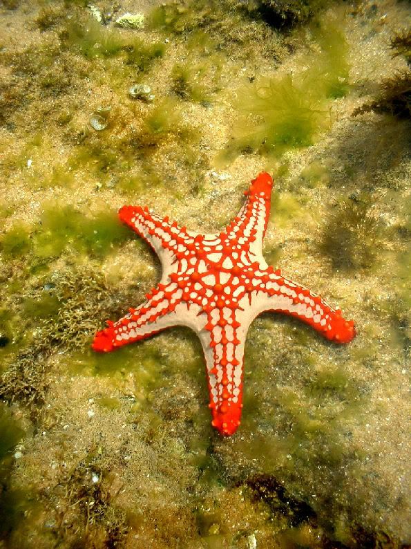
Assignment No. 2: Icon

Source: Starfish
Program used: Photoshop 7
Assignment No. 2: Icon
Source: Starfish
Program used: Photoshop 7
Fri May 18, 2007 5:38 am
Final Round!
Moogie:
Set:


Source
Icon:
Source
Photoshop 7
Zilary
Set


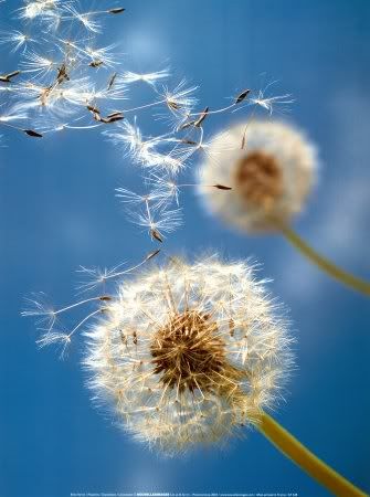
Source:Dandelions
Program used: Photoshop 7
Icon
Source: Starfish
Program used: Photoshop 7
YesItIsh
Set:


Image: blah.
Icon:
Image: bjork! (:
This is the final round! All ratings must be PM'd to me, instead of being posted on the thread!
Ratings are due May 22nd
Good luck to all!
Moogie:
Set:
Source
Icon:
Source
Photoshop 7
Zilary
Set
Source:Dandelions
Program used: Photoshop 7
Icon
Source: Starfish
Program used: Photoshop 7
YesItIsh
Set:
Image: blah.
Icon:
Image: bjork! (:
This is the final round! All ratings must be PM'd to me, instead of being posted on the thread!
Ratings are due May 22nd
Good luck to all!
Fri May 18, 2007 12:03 pm
Wow, stunning entries from everyone. This will be hard to judge.
WIS, would you mind keeping us posted as to when judges have sent you their judgings? Just so that we aren't totally oblivious?
WIS, would you mind keeping us posted as to when judges have sent you their judgings? Just so that we aren't totally oblivious?
Fri May 18, 2007 7:06 pm
moogie wrote:Wow, stunning entries from everyone. This will be hard to judge.
WIS, would you mind keeping us posted as to when judges have sent you their judgings? Just so that we aren't totally oblivious?
No problem.
Nobody has sent in their judgings so far.
Sat May 26, 2007 11:59 am
the suspense is killing me D:
Sat May 26, 2007 6:08 pm
I've done my judgings. D: None of the other judges have, however. I am going to go bug them.
Tue May 29, 2007 11:12 pm
If none of the judges submit their ratings within the next 24 hours, the outcome of the contest will be based on my ratings only.
Wed May 30, 2007 3:39 am
gradings PM'd
Thu May 31, 2007 12:10 am
Firstly, my ratings.
Final Round!
Secondly, blueZ's ratings.
Final Round!
Moogie:
Set:
I really like this set.It's very bold, and eyecatching. Looking at your original image, you did a good job of concealing/cleaning up the artifacts. The placement of the image is also very nice. I really like the scanlines, and how you erased parts of it so that it doesn't cover the main object of the signature completely. I really like the borders, they are simple yet unique. The text is nicely done as well. What I didn't see right away, though, was the little bits of color you added around the main image. It really makes the whole signature stand out.
Icon:
Very clean and simple. I like that a lot.
Zilary
Set
I really like this set also! It's very clean and sharp, I like that. The text is very nicely placed and the font choice fits this set very nicely.
Icon
It's a cute little icon.- 8.25/10
YesItIsh
Set:
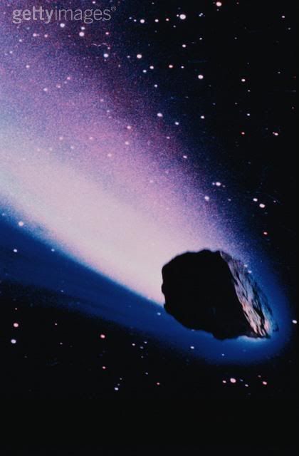
I really, really like the concept of this signature. The ideas and some of the technical qualities of it are very nice. I really like the main text, because I was surprised it would work so well. Good job recreating some of the stars, and working with a low quality image. However, I have to say, I'm not too fond of the colors of this set. I think, perhaps a little sharper, and more contrast (with different colors) would have served this set well. The whole signature feels a little drab and blurry. - 8.75/10
Icon:
On first sight, I couldn't tell what this icon was.
Secondly, blueZ's ratings.
blueZ wrote:Moogie:
Set: - 8.6/10
very nice composition and arrangement, its very interesting and intrigues the eye.
but one little thing is i think the bold black border and the strong scanlines doesnt fit with the softness of the image, other than that good job!
Icon:9/10
great and smart color choices, very pleasing to the eye, the text was nicely placed as well, strong yet subtle.
Zilary
Set9.8/10
outstanding, very simple, but effective, wonderful and smart colors.
you successfully created a atmosphere of lightness, great text as well.
very good set.
Icon 8/10
not as good as your set but, it has its good qualities, i think the focus was very well done here, theres a clear thought of composition, and text is bold and nice as well. but i think the black diagonal lines stands out just a bit too much.
YesItIsh
Set:9/10
i absolutely adore the color scheme here, its very nice and gentile, the text is nice as well, however, i think the focus here is just a bit off here for me. because i couldnt really tell if the focus was on the text or the rock. but just other than that, very good set
Icon:8.5/10
first of all, very nice colors, i liked how you stuck with a few colors only to keep it simple, how ever, i think the content is not as simple as it should be. i think there is just a bit too much going on, and it doesnt have a clear focus which confuses the eye. remember, less of more, cha cha cha Sharmen....(yeah i went there)
Thu May 31, 2007 12:15 am
Moogie's Scores:
Set: 9.5 + 8.6 = 18.1
Icon: 9 + 9 = 18
Total: 36.1
Zilary's Scores:
Set: 9.25 + 9.8 = 19.05
Icon: 8.25 + 8 = 16.25
Total: 35.3
YesItIsh's Scores:
Set: 8.75 + 9 = 17.75
Icon: 8.5 + 8.5 = 17
Total: 34.75
...
Congratulations to MOOGIE!
He is the winner of the second PPT Graphics Academy! Moogie, please post or PM a tradelink for your neopoint prize.
Congrats to also Zilary and YesItIsh for making it this far.
Set: 9.5 + 8.6 = 18.1
Icon: 9 + 9 = 18
Total: 36.1
Zilary's Scores:
Set: 9.25 + 9.8 = 19.05
Icon: 8.25 + 8 = 16.25
Total: 35.3
YesItIsh's Scores:
Set: 8.75 + 9 = 17.75
Icon: 8.5 + 8.5 = 17
Total: 34.75
...
Congratulations to MOOGIE!
He is the winner of the second PPT Graphics Academy!
Congrats to also Zilary and YesItIsh for making it this far.
Last edited by WIS on Thu May 31, 2007 2:54 am, edited 1 time in total.
Thu May 31, 2007 12:38 am
Moogie is a he, WIS.
***
OMG MOOGS I AM SO HAPPY FOR YOU AND YOU ARE SO BRILLIANT I LOVE YOU <3
***
OMG MOOGS I AM SO HAPPY FOR YOU AND YOU ARE SO BRILLIANT I LOVE YOU <3
Thu May 31, 2007 12:52 am
Congrats to Moogie! ^______^ You definitely deserved it (:
And thanks for hosting WIS, and the judges for judging xD
And thanks for hosting WIS, and the judges for judging xD
Thu May 31, 2007 8:04 am
Thanks to all who participated in this! While some of the rounds took a little while to finish, it was a whole lot of fun!
Thank you to the judges for the recognition, I really worked hard throughout this competition, and it really feels good to win.
Congratulations to Zilary and YesItIsh. You each made remarkable graphics throughout the entire contest, you were great competition.
( http://www.neopets.com/island/tradingpo ... =263645742 )