Bangel - I haven't seen any graphics of yours in a while...it's very good. However, the font is really hard to read. I love Violation, but it's very hard to read when it's on Overlay or is at a somewhat low opacity. It took me 4 minutes or so just to know it was MICROSOFT Paint Tutorials, not Megatron Paint Tutorials. XD
Quicksilver - Your first set, now? I'd have to agree with Bangel, my first set wasn't all that swell either. The sig really needs a border, because that's one of the most important parts of a set. Also, the border on the avatar is kinda pixelly, but you can't do anything about that. Other than that, amazing set for your first time!

----------------------
I made this set for Hugs for Hawk Nelson the other day, and would like some ratings.


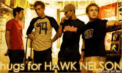
Original image:
http://www.purevolume.com/hawknelson/photos/14095
(NOTE: the sig is cut in two different ways. The top takes you to hugsforhn.t35.com, and the bottom heads to tinyurl.com/dxcat, it displays the right way in InvisionPro Board, as seen
here)




 The avatar has wonderful simplicity to it, which I love. The signature is quite nice also, but the plain font detracts from the appeal a bit. ^_~ Overall, pretty good. 7/10








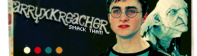










 ) I'm worried about the last line, it feels like it doens't have enough syllables because in the movie he says a rude word.


