Ratings
Moderator: Moderators
-
thy_hobbit
- Newbie

- Posts: 6
- Joined: Fri Aug 26, 2005 10:44 am
- Location: Trapped in my computer!!
- Contact:


Anubis- Cute. ^^ It's really nice simple. I like it. Except the black pixel things in the signature look a little odd against the grey. I don't know how to explain it. XD Anyway, the av is good but I think it could have used a little white. And there's a pink dot near the 'N' which confuses me. o.o
Moogie-Have I ever told you I love your graphics? 'Cause I do. This is nice...kinda elegant if that makes senes. The only problem is the 'g' in burning, which looks like a light circle. Also, maybe you could have made 'Desire' a different color. Either way, it's a nice icon.
thy_hobbit-You can stick to that or request one at the Av & Signature Requests forum.
Moogie-Have I ever told you I love your graphics? 'Cause I do.
This is nice...kinda elegant if that makes senes. The only problem is the 'g' in burning, which looks like a light circle. Also, maybe you could have made 'Desire' a different color. Either way, it's a nice icon.
thy_hobbit-You can stick to that or request one at the Av & Signature Requests forum.

-
thy_hobbit
- Newbie
- Posts: 6
- Joined: Fri Aug 26, 2005 10:44 am
- Location: Trapped in my computer!!
- Contact:
-
thy_hobbit
- Newbie
- Posts: 6
- Joined: Fri Aug 26, 2005 10:44 am
- Location: Trapped in my computer!!
- Contact:
-
.:Requiem:.
- Beyond Godly

- Posts: 3297
- Joined: Fri Jun 04, 2004 3:43 am
- Location: Set by me.
- Contact:
Moogie--I really love it! It's very elegant..I like how all the colors work so well. The last parat of 'burning' is pretty hard to read, though.
Anubis-Very cute. It's simple, but I like it. Only problem is you've got a pixel out of place by the avatar text.
Someone rate my current set?
Anubis-Very cute. It's simple, but I like it. Only problem is you've got a pixel out of place by the avatar text.
Someone rate my current set?
Mas mothaionn tu fein mar rud eigin caite ar an dtra...

Lig dom goideail an croi duit...
Lig dom goideail an croi duit...
Anubis - I really like that! It's so simple, yet so... good
The strange anubis text looks a bit odd and out of place. I don't think you need it.
The avatar is nice and simple so it doesn't ruin the sig or anything too .
.
mogie - That image looks very proffetional. I think it is very good
Can someone rate this?:
The strange anubis text looks a bit odd and out of place. I don't think you need it.
The avatar is nice and simple so it doesn't ruin the sig or anything too
.
mogie - That image looks very proffetional. I think it is very good
Can someone rate this?:
-
Sapphire Faerie
- Honorary Member

- Posts: 2918
- Joined: Mon May 31, 2004 3:20 pm
- Location: Paducah, KY
Moogie - Is that Uma Thurman? I like the positioning of the text, it almost makes the graphic look 3D, like "A Burning" is in the background, the girl is in the middle ground, and "Desire" in the foreground. The tail on the D going over her shoulder bothers me though. It just looks a little rough. Also, with the text of "Desire" being semi-transparant, it looks a little funny with part of it in front of her. It makes the D look like it's a totally different colour than the rest of the word. It just looks a little off to me.
.:Requiem:. - Silver and dark blue! My colours! **steals** My favourite part of this set is all of the borders and cut outs. Especially how some of them are actually transparent, and some are white. The solid blue background feels a little plain and blocky though. It might look good with some brushes or texture. A slightly lighter silver for the main text on the sig might look a bit better too. It would stand out better.
Any ratings for my new set?

.:Requiem:. - Silver and dark blue! My colours! **steals** My favourite part of this set is all of the borders and cut outs. Especially how some of them are actually transparent, and some are white. The solid blue background feels a little plain and blocky though. It might look good with some brushes or texture. A slightly lighter silver for the main text on the sig might look a bit better too. It would stand out better.
Any ratings for my new set?

-
.:Requiem:.
- Beyond Godly
- Posts: 3297
- Joined: Fri Jun 04, 2004 3:43 am
- Location: Set by me.
- Contact:
Chass--Thanks. ^^ It took me aeons to do the cutouts. I wanted to try to do something with the blue, but it's hard to do so in Paint without messing stuff up baad.
I just saw your set a few minutes before I chcked this..I LOVE IT! It's sort of simple and complex at the same time..I love tho colors, the text...all of it. i want it...-steals-
I just saw your set a few minutes before I chcked this..I LOVE IT! It's sort of simple and complex at the same time..I love tho colors, the text...all of it. i want it...-steals-
Mas mothaionn tu fein mar rud eigin caite ar an dtra...
Lig dom goideail an croi duit...
Lig dom goideail an croi duit...
-
Matt
- Honorary Member
- Posts: 1869
- Joined: Mon May 31, 2004 11:04 am
- Location: Dundee, Scotland
- Contact:
Requiem: I really like your sig. The picture's cool, and I think the way you've used cut-outs is rteally intricate. I feel the one on the left of the picture spoils it a bit though - it's so big and loses the subtlety of the set... The av is the same as the sig, which is a bit disappointing, but it still looks cool. However, you forgot to transparenctise it...
Sapphire Faerie: I love this set. Just curious what the OE IS stands for on the avatar? But apart from this, I do like it. You used a pattern well on teh signature, giving a texture but still making it smooth. The text is readable, but not too obstrusive.
Anyone to rate this current set, please?

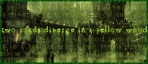
The line is from Keat's The Road which is not taken.
Sapphire Faerie: I love this set.
Just curious what the OE IS stands for on the avatar? But apart from this, I do like it. You used a pattern well on teh signature, giving a texture but still making it smooth. The text is readable, but not too obstrusive.
Anyone to rate this current set, please?
The line is from Keat's The Road which is not taken.

-
Sapphire Faerie
- Honorary Member
- Posts: 2918
- Joined: Mon May 31, 2004 3:20 pm
- Location: Paducah, KY

Requiem - I noticed your set on another board, it's very eyecatching! The dark blue background might have been a bit plain, but the cutouts make it really interesting and are a nice touch. The cutouts on the av and sig are quite different in style, though (especially since the sig has a black border), so it might've been nice if they matched a bit more.
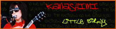
kanashimi - Aw, no-one's rated yours yet. I like the text a lot... the font gives it a funky casual feel, and the red text looks good with the girl's jacket. I'm not sure if I like the yellow and orange as much, though - it's good to stick with a few main colours as a colour scheme, sometimes... especially with bold, bright colours that are being used as highlight colours. Maybe a red border (but sticking to the yellow text) would be good
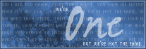
Sapphire Faerie - Very cool! The av looks really awesome, and that was a great idea to use the symbols for letters The sig looks really nice too, but slightly unbalanced to the right, since all the text is over that side. Maybe centering it more, or putting all the text along the bottom (with the "One" rather smaller, but still the same font) would improve the balance a bit. Nah, it looks great though 
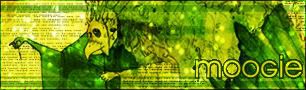
Matt - Woah, that looks really cool! I love all the textures, and the green (I'm going through a green phase at the moment... I blame ScottNak). The writing is a little bit hard to read, but it matches the feel of the set wonderfully. My only suggestion would be to widen the sig slightly, so there's a bit more space on either side of the text - it looks a little cramped at the moment. Giving it some "breathing room" makes it easier to read, too
Anyone like to rate my current av?

And/or my last av...

(I know, I should really make some proper sets... I've been lazy with sigs lately)
kanashimi - Aw, no-one's rated yours yet. I like the text a lot... the font gives it a funky casual feel, and the red text looks good with the girl's jacket. I'm not sure if I like the yellow and orange as much, though - it's good to stick with a few main colours as a colour scheme, sometimes... especially with bold, bright colours that are being used as highlight colours. Maybe a red border (but sticking to the yellow text) would be good
Sapphire Faerie - Very cool! The av looks really awesome, and that was a great idea to use the symbols for letters
The sig looks really nice too, but slightly unbalanced to the right, since all the text is over that side. Maybe centering it more, or putting all the text along the bottom (with the "One" rather smaller, but still the same font) would improve the balance a bit. Nah, it looks great though
Matt - Woah, that looks really cool! I love all the textures, and the green (I'm going through a green phase at the moment... I blame ScottNak
). The writing is a little bit hard to read, but it matches the feel of the set wonderfully. My only suggestion would be to widen the sig slightly, so there's a bit more space on either side of the text - it looks a little cramped at the moment. Giving it some "breathing room" makes it easier to read, too
Anyone like to rate my current av?
And/or my last av...
(I know, I should really make some proper sets... I've been lazy with sigs lately)

Nyum nyum nyum...
-
Sapphire Faerie
- Honorary Member
- Posts: 2918
- Joined: Mon May 31, 2004 3:20 pm
- Location: Paducah, KY
thanks mazil!
Hmm, the first one I like how it is askew, a clever idea. Though, the image is a little blurry. It probably needs to be a bit sharper.
The second one is sharper, and is also good. I like this one more. (btw, is that.. monoke, or am I completely off?)
The only problem with both is they don't seem to stand out as much as some other avatars around, especially the first one.
But they are both of good standard I would have to say.
Anyone like to rate my current av?
And/or my last av...
Hmm, the first one I like how it is askew, a clever idea. Though, the image is a little blurry. It probably needs to be a bit sharper.
The second one is sharper, and is also good. I like this one more. (btw, is that.. monoke, or am I completely off?)
The only problem with both is they don't seem to stand out as much as some other avatars around, especially the first one.
But they are both of good standard I would have to say.