Graphic: http://img.photobucket.com/albums/v87/S ... e/menu.gif
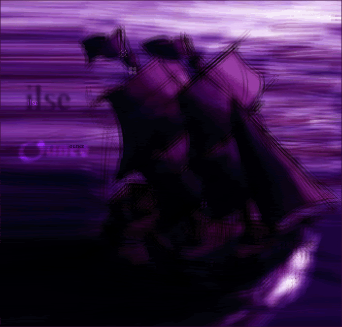
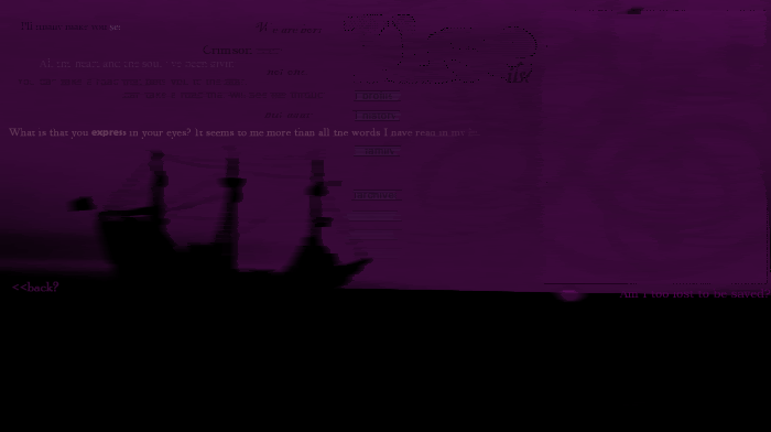
Original Image: http://www.lucidcomics.com/PirateShip.jpg
I had some problem with the image stretch, and I think it looks slightly
out of place, but otherwise, it was simple to make. I used facet and
mosaic to change the lookof the image, stretch as I said before to fill
some space, and I changed the colours, darkened it a bit. Text was
simple aswell, larger text with Gausien Blur and filters, smaller just filters.
First blog (If it stretches the page, I'll change to link):
http://img.photobucket.com/albums/v87/S ... seblog.gif
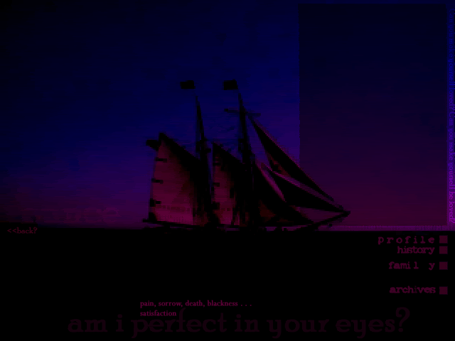
Original Image: http://sessums.net/richard/gallery4/pir ... water2.jpg
One again I used mosaic and faceted. I changed the darkness and tones,
and changed the colour by changing the hue and saturation. I borrowed
all the spiffy quotes from Alex's site 'Lost Thoughts' (which is cool
btw
 ) For the large text, I used a grunge brush as an eraser, and the
smaller text was just normal. The brushes in the background were mosaiced and faceted aswell,
and the blog border was grunge brush erased and the center I think overlayed. Menu buttons were easily done,
handmade with normal text and some opasity changes.
Second Blog:
http://img.photobucket.com/albums/v87/Shadowfare/ounceblog.gif
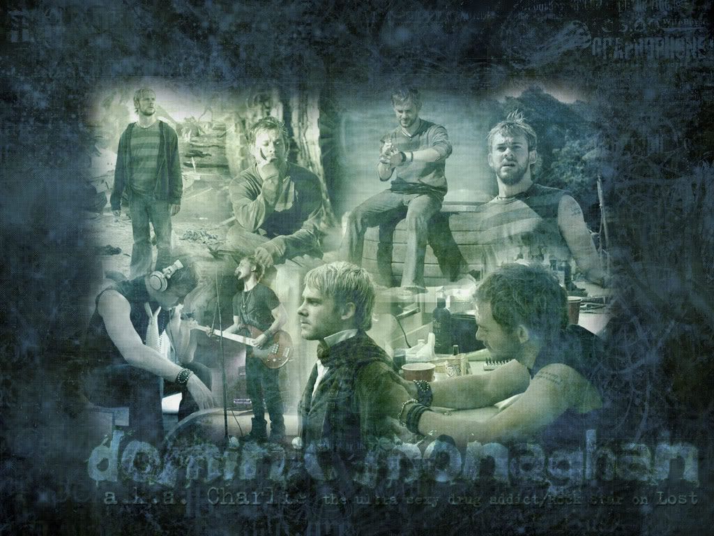
Original Image: http://steve.annex.com/rick/image32.jpg
This is my favourite. I borrowed the quotes from Alex (again) and
Jade_Ems MSN screen name, Faceted and Mosaiced, duplicated the layer
and used a filter then used Water Paper. Buttons handmade, text just
normal, with the two larger ones having change in opacity and an overlay
filter used.
Blog, same border as the last and overlay with a reddish
pinkish original colour for center.
And my ratings:
r4che1--
Its nice, and the subtext is nice. But the sig (it may have looked bad if
you did try it, but I dunno) I have this thing about borders, so maybe a
simple 1px black border?
I think a grayer/brownier text would have mixed in better with the overall
image, but the cutouts are well done (better than mine ever are anyway).
Overall, 8/10
bluehawaii19--
OOO, its sooo pretty ^^; I love it, I like the colours, and the font goes well with the overall style of the layout. The brushes around the edges
look good, but slightly overdone, and I like the texture in the actual
images. Overall:
9/10
Dawn2:
Aww, thats soo cute! I am always amazed with your sets, because you
only have MS Paint to work with, and they always turn out nicely. The
only thing I have against it is that the cutout is very jaggedy around the
edges, but both the texts you used are nice, and go well with the image.
Overall: 8/10



 I also don't like that the subtext border on the sig is fatter than the one on the av. I was going to point out the fading thing where it stops and starts again, but you seem to have learned how that works.