Fri Jun 10, 2005 4:31 am
I actually like it... it does fit the theme of Quetzalcoatl, but I do have a problem with how "bold" it looks, if it was more muted (something to the extent of the Faerie Lenny or Pteri), it would be better.
Fri Jun 10, 2005 4:50 am
Whoah! Not a bad faerie hissi - I guess the chest fur was supposed to give it the Quetz gradient, but yeah, its different. I guess someone out there heard your pleas about not making the hissi too cute and made its head much smaller than its body proportionally XD;
I do like it - the blend of the chest lineart is a plus, as are the wings *-*
When they release it, I'm definately going to start praying to my spare lab account x_x;
The baby nimmo btw is ingenious XD; *eats it*
Edited: o_O I'm currently staring at the fae hissi's main pose wondering why its missing lineart on its wing.
And also I'm honoured you guys liked my hissi concept but the official designs + concepts stupendously pwns me X3;
Fri Jun 10, 2005 6:36 am
I HATE the new Hissi, it looks terrible! The pose makes me think "hunchback," Faeries are supposed to be elegant and flowing. You'd think a flowing look would be easy for a snake. Guess not. And it's furry, while trying to look a little menacing, too contradictory. Not to mention it's fat  They could've done so much better.
As for the Nimmo, I loved the older one, but this one's just as cute. With creativity points, so I guess I like the new one better.
As for the Nimmo, I loved the older one, but this one's just as cute. With creativity points, so I guess I like the new one better.
Fri Jun 10, 2005 7:41 am
Huggles wrote:It would be a bit more than tolerable if the underbelly was white. I've always hated how they use those two clashing shades of blue for cloud pets.
To be honest, this blue is a perfect match for the cloud hissi but each to their own.

I guess this means the pirates lose. T_T
Atjj wrote:Huggles wrote:So are they finally going to divide up the petpets at the rock pool and give us real Island petpets? I suppose they day that happens is the day they change the name of the robot pepet shop to the Virtupetpet shop to include the new alien petpets.
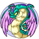
Personally, I'd die if they did the Royal hissies like Zoo's, kind of like when they released the faerie lenny after I sold my honey potion for a faerie pteri. I think the faerie hissi should have feathered wings and resemble quetzalcoatl, so I could die a few more times and get rid of those pesky 8 lives.
If they could make it look like this it would be awesome!

O_O! Yeah!!! It better look like that! but then again, someone could just use that as a "fan based" Rainbow Hissi so I don't think the Faerie Hissi idea, will ever get off the ground.
Anoohilator wrote:"Stupid old king" is more like it but you're probably right
Is it me or was the last ruler of Maraqua a QUEEN? I remember HER being a Yellow Koi, not a Blue Koi... And "Scarblade" was a Skeletal Kiko, not a Green Lupe.
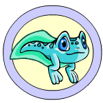
Silentroar wrote:Unfortunatly tnt didn't make the faerie hissi look as good as that. They came up with THIS:
also they revamped the baby nimmo. I like it.
Armi wrote:I don't like faerie Hissi, not one bit. it seems WAY too rushed, IMO. It could have been much better.
Baby nimmo..I'm mixed on it. I mean, it's a tadpole now,but the poses...again rushed.
I'm not a fan of rushed stuff, so I'm not happy with either colors.
Plus on baby Nimmo...TNT needs to redo this BG image.
If you can't tell why...well...you can't. =/
I don't see why... Because that could be just a "younger" nimmo. Now that we have a "tadpole" version, this can be considered a youngster instead of a baby. Besides, they haven't redone any of the lupe BG's and I doubt they'll ever will.
Fri Jun 10, 2005 9:10 am
If you can't tell why...well...you can't. =/[/quote]
I don't see why... Because that could be just a "younger" nimmo. Now that we have a "tadpole" version, this can be considered a youngster instead of a baby. Besides, they haven't redone any of the lupe BG's and I doubt they'll ever will.[/quote]
youngster paint brush, that will be cool =X
the Fishing Vortex caption contest was changed to a Maraquan one!
Fri Jun 10, 2005 9:25 am

Oh, I haven't seen that up until now! I really need to get one of those.
Fri Jun 10, 2005 9:52 am
Aww, I like the faerie Hissi
HISS!! Doesn't he look just disgusted by everything he sees?
Fri Jun 10, 2005 10:32 am
I like the faerie, but the things I dislike or not like so much are the bold colors and how round they made it. Looks like they tried to squeeze it into the circle instead of letting more parts stick out form the frame.
I wish they would flip the close range and range picts on hissis though. I like The close range looks a lot more dinamic.
I wish they would flip the close range and range picts on hissis though. I like The close range looks a lot more dinamic.
Fri Jun 10, 2005 10:34 am
Butterflyhornet wrote: Looks like they tried to squeeze it into the circle instead of letting more parts stick out form the frame.
Now that you mention it, it does look that way!
Fri Jun 10, 2005 10:59 am
Silentroar wrote:Unfortunatly tnt didn't make the faerie hissi look as good as that. They came up with THIS:
also they revamped the baby nimmo. I like it.
I love the tadpole, especially it being a little older and in a more frog-like stage - great idea and well executed x) The hissi...great idea but it looks totally icktastic. Normally I am very forgiving when it comes to new colours and so on, but this for me goes in the tray marked "awful faerie pets" far far away from the pteri and lenny. Great idea, terrible execution. The art looks flawed in many places, the head look stuck on and it just doesn't work at all.
It could have been so good! *cries* A complete rush job :/
Fri Jun 10, 2005 11:10 am
Trick wrote:Silentroar wrote:Unfortunatly tnt didn't make the faerie hissi look as good as that. They came up with THIS:
also they revamped the baby nimmo. I like it.
I love the tadpole, especially it being a little older and in a more frog-like stage - great idea and well executed x) The hissi...great idea but it looks totally icktastic. Normally I am very forgiving when it comes to new colours and so on, but this for me goes in the tray marked "awful faerie pets" far far away from the pteri and lenny. Great idea, terrible execution. The art looks flawed in many places, the head look stuck on and it just doesn't work at all.
It could have been so good! *cries* A complete rush job :/
I never noticed the feathers on its forehead. Those are nice.
Fri Jun 10, 2005 11:49 am
Nimmo Day CC:
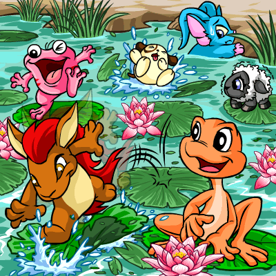
Quiggle Day front page image:

Also the caption for today has changed from that weird fishing one:
Quiggle Day front page image:
Also the caption for today has changed from that weird fishing one:
Fri Jun 10, 2005 11:55 am
Trick wrote:Nimmo Day CC:
Quiggle Day front page image:
Also the caption for today has changed from that weird fishing one:
...XD
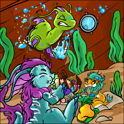
Is anyone else reminded of Winnie The Pooh with that poor Maraquan Chomby stuck in that porthole?
Re: x_x
Fri Jun 10, 2005 2:05 pm
Butterflyhornet wrote:chibizoo wrote:Yeah, I agree with you guys about the mixture of programs. I think a lot of their thicker lineart works are with Flash and some of the really detailed stuff (like wallpapers, etc) with multiple shading layers done with Adobe Illustrator. I do know they use those two cause I read it somewhere on Neopets once (what programs they used - not sure if they ONLY use those anymore)
And yeah, the best of both worlds is always good - photoshop has some neater effects like lens flare and stuff
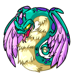
On the topic of hissie colours, I'd love to see them try and do a chinese-dragon style faerie hissie. Something like this?
XD; Please excuse my crappy lineart *not with it today and extremely sick* but that lineart piece I posted/drew from scratch was done on AI >.o (for those who've never used that program)
Only hopefully they're more more creative than my random horns and some hair *eyes it*
That'd almost fit my Serepity. If they can make them like that or like that other picture, than I may consider saving up for a faerie paint brush on that account too.
On the topic about art programs, I somehow guessed they used illustrator as one of their programs. I don't know I guessed that other than the sometimes awkward kinks in the corners that illustrator's pen tool sometimes leaves.
As for flash I haven't used it enough. I used it in a computer class, but I don't own a copy of the program so my experiance in it is limited. I just know if you draw a shape on top of another it fuses that way which makes editing sometimes annoying.
Photoshop- I suspect the battledome challengers were done in photoshop. I zoomed in on the Pirate avenger and saw some semi transparent pixel blending between colors.

I love your drawing! It's so cool, unfortunatley the actual faerie looks kind of fat because of the feathers. I would have loved that if they used your drawing.Mabey they could use that for a royal? Or mabey TNT will come here and see yours and scrap the faerie one and base it off yours like they did with the baby nimmo. hey a person can dream right.
Fri Jun 10, 2005 2:16 pm
Okay- I really dislike the Faerie Hissi. The colors seem to clash, the chest hair is just weird, and it really looks nothing like a snake.
As for the Baby Nimmo, it's not too bad. I like it.
As for the Baby Nimmo, it's not too bad. I like it.