Sun Oct 17, 2004 8:30 pm
Kitten Medli wrote:Anyway, I just got an idea.. it might have already been pointed out, but.. why not take the little bar that shows were you are.. and maybe put that where the ad is, if possible?
I buried that idea somewhere in my exceedingly long and nonsensical post.
Edit- Maybe Create-a-Pet should disappear from the bar when the user has four pets. That would make sense for me at least, although it does make the toolbar harder to program. It always seemed stupid to have it there when I couldn't use it at all.
Even better, what if the toolbar was entirely customisable, like the Portal is? Users could choose which buttons and displays they wanted to see. Then again, that's also a lot more work on the programming side.
Sun Oct 17, 2004 8:49 pm
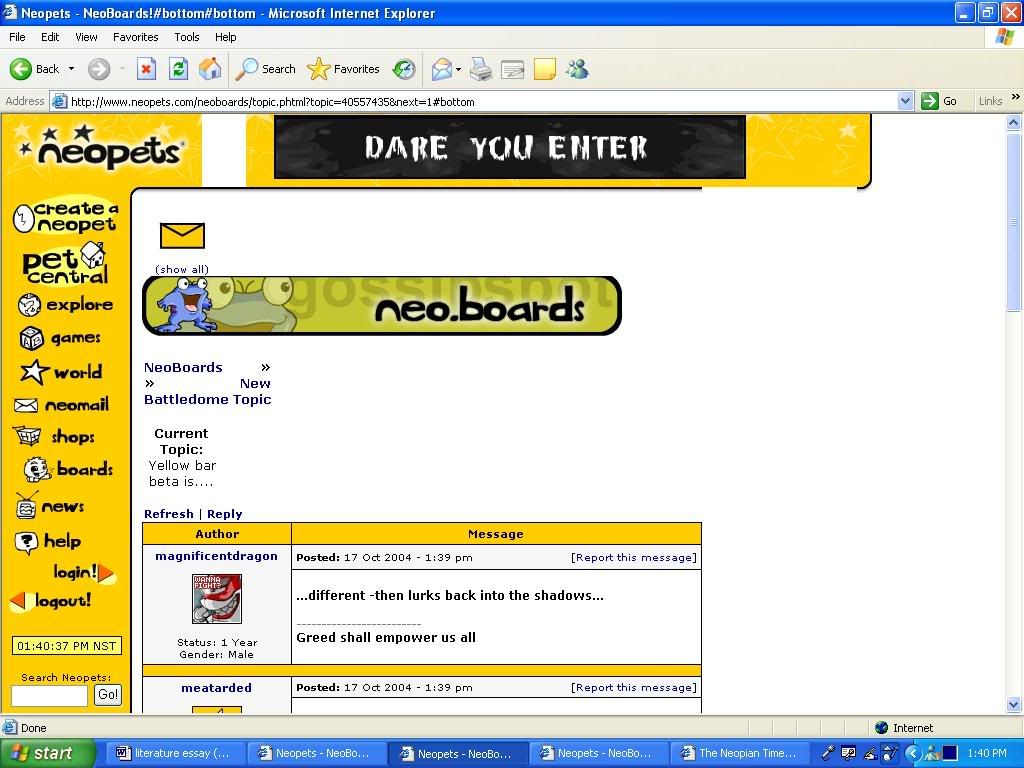
Heh. Looks like our dear Mr. Powell couldn't help but ask the folks at the battledome neoboards about it....
After his post there, all the boards are a riot, as usual. Avatar board in particular.
Anyhow, here's some other screenies of the HUGE new sidebar...snagged these screenies that people were posting they got on the neoboards...
http://img.photobucket.com/albums/v159/ ... artest.jpg
http://boomspeed.com/dizzycafe/_new_top.JPG
The more I look at it, the more I don't like it...it seems a bit dominating. O_o
Sun Oct 17, 2004 9:00 pm
I just got on the BD chat a few minutes ago and they're still talking about the new change. Adam wanted some beta testers.
I don't like the huge ad banner....I'm so going to be having problems refixing my userlook up. -.-
I don't like the huge ad banner....I'm so going to be having problems refixing my userlook up. -.-
Sun Oct 17, 2004 9:16 pm
Seeing it in action in those screens rather than in the demo Adam provided makes me really dislike the banner even more from my perspetive design wise. I still say stick with just a small side banner.
Sun Oct 17, 2004 9:24 pm
Runevalkyrie wrote:Seeing it in action in those screens rather than in the demo Adam provided makes me really dislike the banner even more from my perspetive design wise. I still say stick with just a small side banner.
Have you seen the Meepit Juice Break banner? It's awesome!
heh..Wow, I'd like to be a tester, that'd be fun.
Sun Oct 17, 2004 9:27 pm
For everyone having a spaz attack for the look-ups you shouldn't be worried. Its probably going to take forever to get this side bar all worked out, get testers then put it on the whole entire site! So I bet they'll have enough time to accept a bunch of userlook-ups and most of you shouldn't be worried  Just hope they remember...
that's exactly what I thought!!
I know we're all annoed about that HUGE top banner but After I think about it for a bit, a while, a long long time, its not SOO horrible, it will keep the site free as long as it doesn't take FOREVER to load I'll be pretty fne with that banner
Changing World+Pet central to Reference would be nice but woud it fit?
I thought he said the secret thing had to do with avatars or something?? lol
EDIT: Why am I never around to actually see the actual thing?? Okay those new screen shots are okay I guesbut it totally screwed up how the neoboards should look.
I like the new style... with one exception. The large ad at the top of the page. Its too big, and honestly, un-needed.
My suggestion:

that's exactly what I thought!!
I know we're all annoed about that HUGE top banner but After I think about it for a bit, a while, a long long time, its not SOO horrible, it will keep the site free as long as it doesn't take FOREVER to load I'll be pretty fne with that banner
Changing World+Pet central to Reference would be nice but woud it fit?
I bet that secret thing is site themes/skins. Which I have been requesting to the Editorial for about a year and a half. *takes all the credit*
I thought he said the secret thing had to do with avatars or something?? lol
EDIT: Why am I never around to actually see the actual thing?? Okay those new screen shots are okay I guesbut it totally screwed up how the neoboards should look.
Sun Oct 17, 2004 9:39 pm
man, according to those screenshots I'm gonna have some horrid horizontal scrolling going on with 800x600 res. is the size of that banner really necessary?? even at 70% of the size it is it would be okay. screenies can be weird though. hmm.
Sun Oct 17, 2004 9:58 pm
kali wrote:man, according to those screenshots I'm gonna have some horrid horizontal scrolling going on with 800x600 res. is the size of that banner really necessary?? even at 70% of the size it is it would be okay. screenies can be weird though. hmm.
1024x768 isn't too huge of a jump in resolution. You should be able to adjust to it quickly if you change it.
Sun Oct 17, 2004 10:04 pm
Naniwai wrote:Even better, what if the toolbar was entirely customisable, like the Portal is? Users could choose which buttons and displays they wanted to see. Then again, that's also a lot more work on the programming side.
having customisable toolbars would cause EVEN MORE complaints from people that have customised look-ups. you wouldnt be able to cover it at all as everyones would be different
Sun Oct 17, 2004 10:28 pm
DiscordantNote wrote:kali wrote:man, according to those screenshots I'm gonna have some horrid horizontal scrolling going on with 800x600 res. is the size of that banner really necessary?? even at 70% of the size it is it would be okay. screenies can be weird though. hmm.
1024x768 isn't too huge of a jump in resolution. You should be able to adjust to it quickly if you change it.
yeah, I know, I much prefer 1024x768, but my computer won't let me change res. a lot of older laptops are like this. fixed res. sucks eh. I do think good design means being cross-browser/resolution compatible though.
Sun Oct 17, 2004 10:38 pm
Wow...the new ads look really nice. My favorite right now is Moon Rock Rampage, though Meepit Juice Break isn't bad either.
Sun Oct 17, 2004 10:51 pm
a Guide to icons, hehe.

Neomail

Battledome challenge

Battle Accept

Trade Offer

Trade Closed

Guild Invite(currently appearing for item sending)

Neofriend Request

Neofriend Accept
In addtion, hovering your mouse over the icon gives you information on what has occured. For example, when you recieve an item(currently, that image isn't working) it'll say "XXXX has sent you a XXXXX" Pretty nifty stuff!
Uber speical thanks to Rune, Spira, and Cae! [/img]
Neomail
Battledome challenge
Battle Accept
Trade Offer
Trade Closed
Guild Invite(currently appearing for item sending)
Neofriend Request
Neofriend Accept
In addtion, hovering your mouse over the icon gives you information on what has occured. For example, when you recieve an item(currently, that image isn't working) it'll say "XXXX has sent you a XXXXX" Pretty nifty stuff!
Uber speical thanks to Rune, Spira, and Cae!
Sun Oct 17, 2004 11:00 pm
I was playing around earlier, might something like this be a better sidebar - minus that new huge topbanner ... keeping the "old" normal banners that we all love  Now this is just a "mock up", don't want to insult or anything. Just an idea I had ... Reference instead of world, so there's not the world/explore click confusion ...

Sun Oct 17, 2004 11:39 pm
Ugh, yeah..just the thought of NQ2 with that ...thing at the top.
I'm much more awake now, so I'll be slightly more coherent.
Reasons against the top banner ad:
1) It's ugly, in your face, and will probably end up giving me seizures.
2) at 640 x 480 (the resolution I usually have to work in when I'm not wearing my glasses because they give me mega headaches (vision impaired)) it is even more horrible, since it doesn't resize. Hell, it's even too big in 1200 x 1024 (what I use when I have my glasses on and an LCD monitor in front of me) to look good.
3) It's going to add a lot of time to slow loaders. PLUS there are people out there (me 4 months ago -.-;) who have limited data transfers. This isn't going to be good for them, because those big flash banners are going to add to download limits like wildfire, and can't be turned off through IE (I have wonderful memories of playing NQ1 without any pictures other than what had been cached).
4)Ewww...cold coffee is horrible. Oops, sorry.
5) On less powerful computers, it will lag them horribly. *looks at her dad's* On a good day, Neopets can be open with one other website as well. On a bad day, the computer chokes when I go to the wheels, or even the main explore page in image (not flash) mode.
6) The majority seem to be against it. I know this might not sound like too much of a reason, but if Adam asked us for our opinions, I had hoped that means he will listen to them and take them into account. And the main opinion seems to be to get rid of the top banner ad.
There we go... I probably would have some other reasons, but I'm really in need of more coffee...mmm...coffee... that's not cold.
Mon Oct 18, 2004 12:11 am
Ledi wrote:6) The majority seem to be against it. I know this might not sound like too much of a reason, but if Adam asked us for our opinions, I had hoped that means he will listen to them and take them into account. And the main opinion seems to be to get rid of the top banner ad.
ledi, would the possiblilty of having regular, or animated, images rather than the flash (or whatever) it is at the moment be a better compromise do you think?